Pick the feeling first, then the color. That one reversal is the difference between a bathroom that just looks fine and one that actually changes how you feel when you walk in. The first question I ask a client is never what color they want; it is whether they want the room to calm them, wake them up, or wrap them in something rich and quiet.
These 17 bathroom color ideas are organized by the mood they create, from soft neutrals to deep, dramatic darks. I will walk through which palettes suit which rooms, how to keep each one from going wrong, and the testing trick that saves you from repainting. Because here is the catch nobody mentions: the same color can feel completely different depending on the light it lives in.
Color by Mood, at a Glance
| The mood | The palette | Best for |
|---|---|---|
| Calm and spa-like | Warm whites, greiges, soft greens, pale blue | Small or busy baths |
| Bright and energizing | Crisp white with high-contrast black or pastels | Windowless or dark rooms |
| Moody and rich | Deep navy, charcoal, forest with warm metals | Powder rooms and retreats |
Design the Mood: Calm, Energizing, or Rich
Color is the cheapest way to change how a room feels, which is exactly why you should decide on the feeling before you fall for a swatch. A bathroom can do one of three things emotionally: settle you, lift you, or envelop you. Name that first and every later choice, the wall, the tile, the towels, gets easier and more cohesive.
I make clients say the mood out loud before we open a single fan deck. Calm leans on soft, low-contrast neutrals and natural texture. Energizing wants brightness and a sharp accent. Rich means deep color and warm metal. Once the feeling is set, the palette almost picks itself.
- Calm: warm whites, greiges, sage, and pale blue with matte, natural textures.
- Energizing: crisp white plus a bold contrast, or a clean, happy pastel.
- Rich: navy, charcoal, or forest grounded with brass and warm wood.
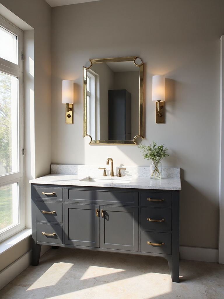
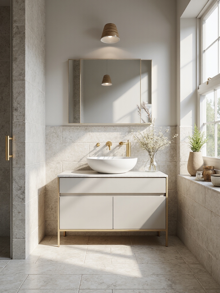
Serene Neutrals: Warm Whites and Greiges
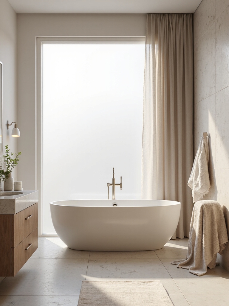
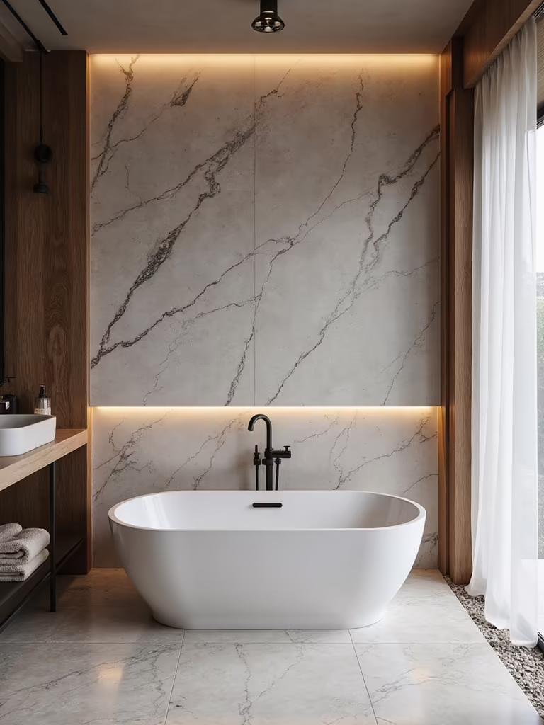
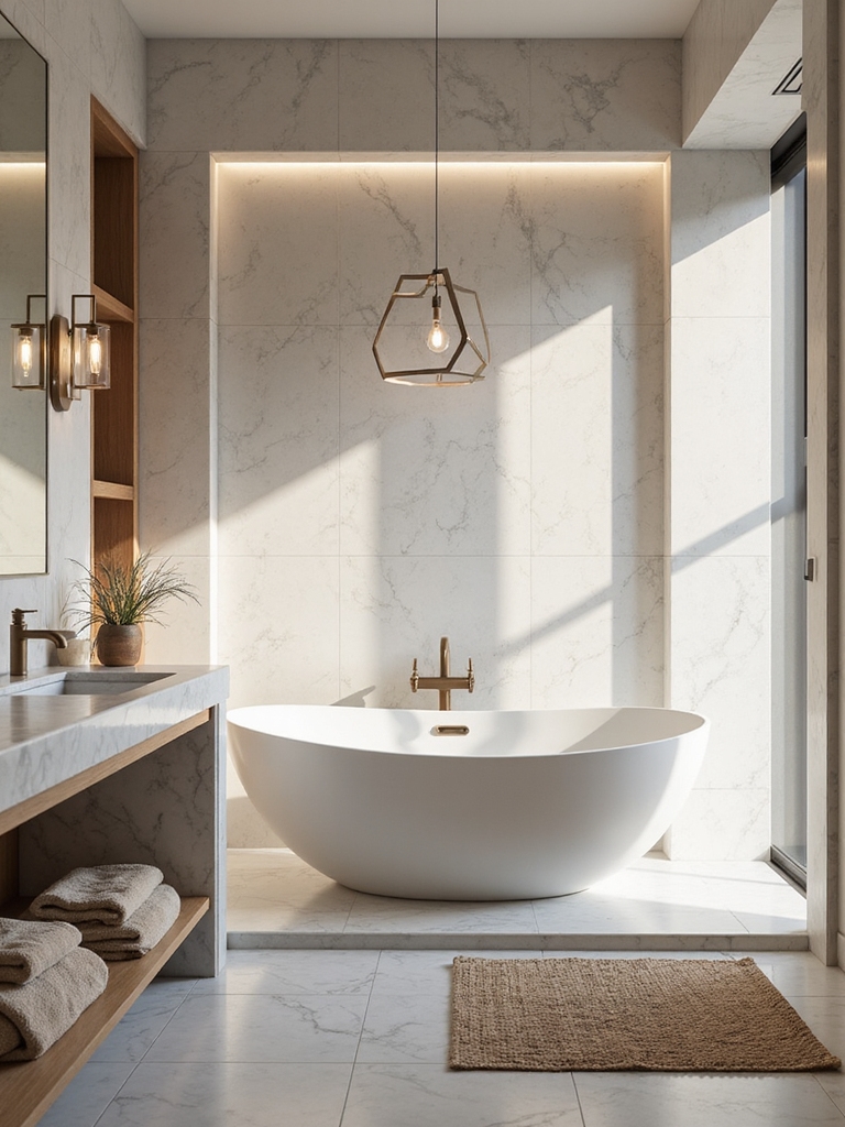
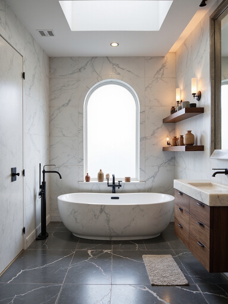
Neutrals are the safe harbor of bathroom color, and the trick to keeping them from feeling like a builder special is undertone and texture. I lean on warm whites and greiges with a soft beige or taupe base, because a true cool gray can turn cold and clinical under bathroom light. The warmth is what makes a neutral room feel like a hug. I have repainted my own bath twice chasing exactly the right white.
Texture does the heavy lifting once the color stays quiet. Matte tile, satin fixtures, a chunky linen towel, a wood stool: layering surfaces is what gives a neutral bath depth and keeps it from going flat. The color whispers; the materials speak.
This palette suits almost any room and any budget, which is why it is my default for a space that has to stay restful day after day. A gallon of quality paint runs about $30 to $60, so neutrals are the cheapest mood you can commit to. Let natural light do the work, keep contrast low, and the whole bathroom settles. The palette I talk most clients out of is a stark, cool gray, which goes lifeless in bathroom light.
🅰️Light and airy
Warm whites, pastels, and soft neutrals open up a small or dark bath and feel calm and clean. Lowest risk, easiest to live with, and the most forgiving with bad light.
🅱️Dark and moody
Navy, charcoal, or forest wraps a room in drama and works best in a powder room. Higher impact and higher risk; it needs warm metals and good lighting to feel cozy and inviting.
Timeless High-Contrast Schemes
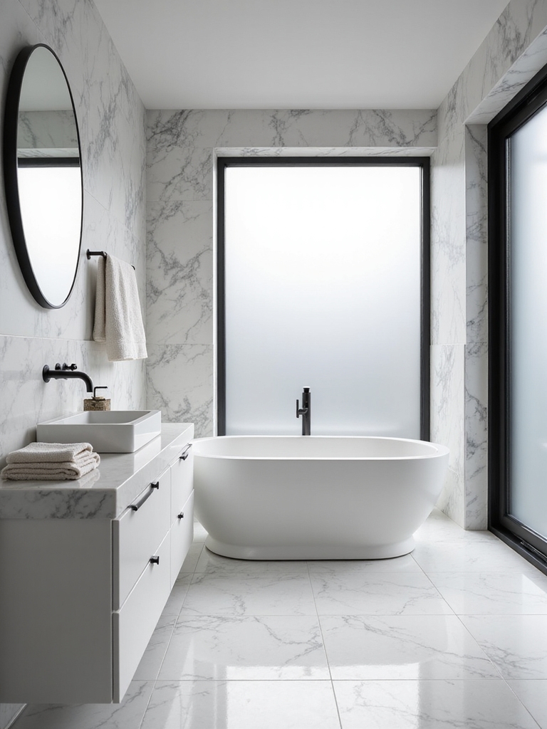
If calm is not your goal, contrast is the fastest way to make a bathroom feel crisp, structured, and wide awake. Pure white walls with sharp dark accents, matte black hardware, a charcoal vanity, a black-framed mirror, look clean and modern and age well. The high contrast is energizing in the morning and forgiving on a small budget, since most of the drama comes from inexpensive hardware swaps.
- Pair bright white walls with matte black fixtures and hardware for instant structure.
- Add one textured surface, like terrazzo or stone veining, so the scheme has depth.
- Keep metals consistent so the contrast looks intentional and clean.
Soft Pastels That Brighten a Small Bath
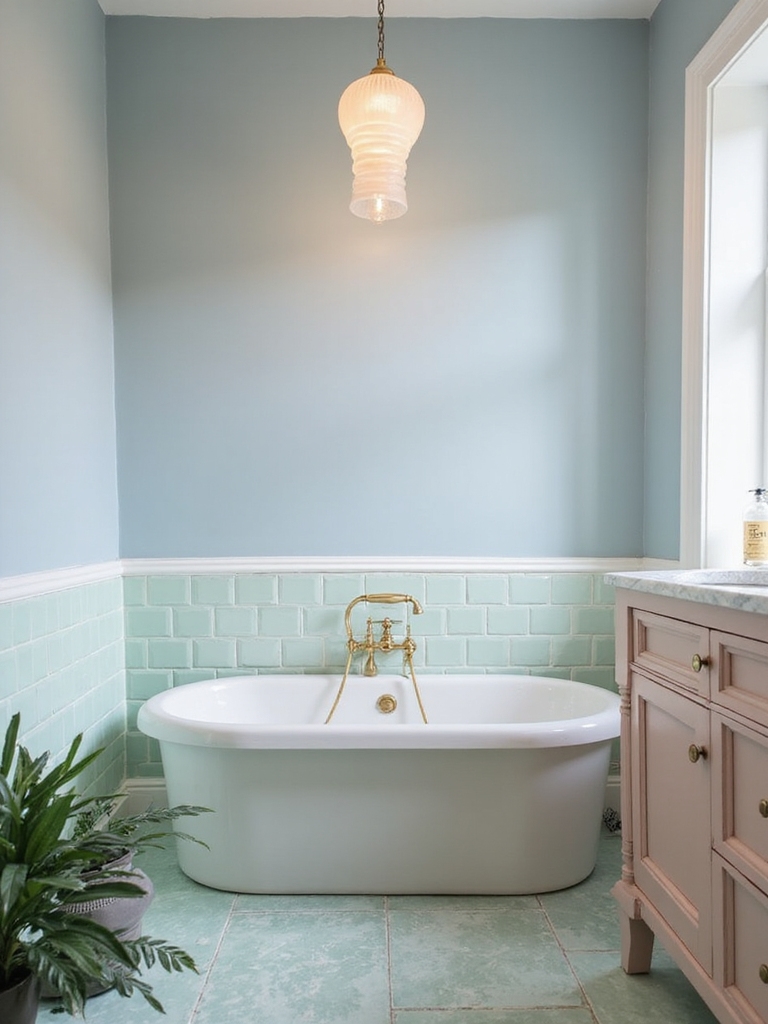
Pastels are the quiet trick for a small or windowless bath, because a gentle wash of color lifts the room without the weight a saturated shade brings. Blush, pale blue, soft mint, and buttery yellow each add personality while keeping the space feeling open and bright. Here is how to use them well:
- Choose one soft pastel for walls or cabinetry and keep the rest crisp white.
- Lean slightly grayed pastels over candy-bright ones so the room looks grown-up; a pale blue works beautifully, as these baby blue bathroom ideas show.
- Bring the color in through paint or peel-and-stick tile, then echo it in towels.
Good to Know
Color temperature is measured in Kelvin. Lower numbers (2700K to 3000K) are warm and cozy and flatter most bathroom palettes; higher numbers (4000K and up) are cool and clinical and can drain the warmth right out of a neutral or pastel scheme.
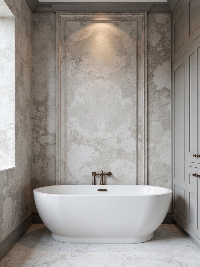
Moody Darks for Drama and Retreat
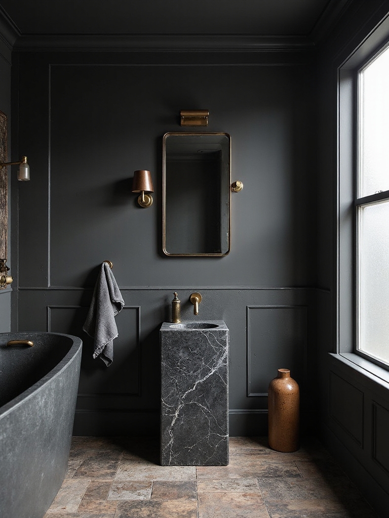
A dark bathroom is the boldest mood and, counterintuitively, one of the coziest. Deep charcoal, rich navy, or forest green wraps a room and makes it feel like a private retreat, especially in a small powder room where the enveloping effect works in your favor. The fear that dark shrinks a space is mostly a lighting problem, not a color one.
Light It Right or the Dark Falls Flat
Warmth is what keeps moody from turning into a cave. I pair deep walls with warm metals and soft texture, brass fixtures, an amber sconce, a velvet stool, and layer in good light at face level. That combination sculpts the room, and the dark becomes intimate and warm.
Save the boldest version for a powder room you do not bathe in for an hour every morning. It is the lowest-risk place to go dramatic, and it is the room guests remember. Light it well, warm it up, and a dark bath becomes the most memorable surface in the house.
Earthy Greens and Botanical Tones
Green is having a long moment in bathrooms, and for good reason: it is the color the eye finds most restful, which makes it a natural fit for a spa-like room. I mix sage and soft moss with warm neutrals, so the green feels calm and organic rather than loud. It bridges the gap between a true neutral and a real color, which is why nervous clients say yes to it so easily.
Keep the botanical theme subtle so the room breathes. A framed leaf print, a few green towels, a single trailing plant: a light touch feels fresh. Wall-to-wall botanicals tip into busy. The plant earns its place twice, adding life and reinforcing the palette at once.
Sage pairs with almost everything you already own, from brass to black to natural wood. That flexibility is why it has staying power beyond the trend cycle. Matte finishes and natural texture push the spa feeling further, and the whole room lands somewhere between calm and quietly current.
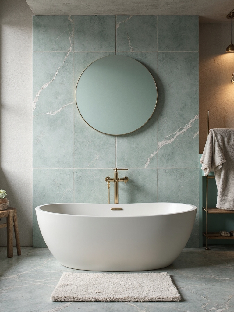
Ocean Blues and Aquas
Blue is the bathroom classic that never really leaves, because water and blue belong together and the color looks instantly clean. Deeper ocean blues feel serene and grounding, while bright aquas and seafoam add a livelier, beachy energy. The mood swings a lot within the family, so the shade you pick matters more than the color name.
I anchor a blue bath with one dominant tone and let white fixtures keep it crisp, then add small shifts through tile or a towel. A grayed, slightly muted blue flatters the white porcelain most bathrooms already have, which keeps the room from feeling like a theme. Coordinate it with the light, since blue is the shade most likely to go gray in a dim room.
- Pick one dominant blue and echo it with white trim and fixtures.
- Choose a slightly grayed blue over a primary one so it reads calm and modern.
- Add lively aqua only as an accent if you want energy without committing the walls.
Blush, Peach, and Warm Accents
Warm accents are the easiest way to soften a cool, hard bathroom, and they are almost always reversible. Subtle blush and peach add a flattering glow that warms up cool tile and chrome, and they look surprisingly grown-up when you keep them muted and pair them with crisp white. I bring these in through towels, soap, and a storage lid, rarely the walls, so the warmth is easy to dial up or swap out.
The reason this works is light: warm tones bounce a soft, flattering glow, which is why a blush towel can make a whole white bath feel kinder. Use it as the supporting color and it looks elegant and grown-up. It is the lowest-commitment way to shift a room’s mood by a few degrees.
How Light Changes Color, and How to Test It
Here is the step that saves the most regret: test the color in your actual bathroom, where it will live. Light changes everything. Trust it over the swatch. A shade that looks perfect under showroom fluorescents can turn gray, green, or muddy under your warm bulbs at home, and bathrooms are full of tricky, mixed light. I have watched the same swatch read like two different colors morning and night.
So I test every color the slow way. Paint a large sample on the wall that gets the least daylight, then look at it at three times: morning, midday, and under your lamp at night. Live with it for a day or two before you commit, because the only light that matters is the light it will actually live in.
Match your bulbs to the mood while you are at it. Warm 2700K to 3000K light flatters neutrals, blues, and darks, while a cooler bulb can wash out a soft palette. Sort your fixtures by lighting tone before you finalize the color, because the two decisions are really one.
Bathroom Color Questions, Answered
?What is the most calming color for a bathroom?
Soft, warm neutrals and gentle greens top the list. Warm whites, greiges, and sage create a low-contrast, spa-like calm that is easy to live with, and a pale, slightly grayed blue is a close second. The key is keeping undertones warm and contrast low so the whole room soothes.
?Can a small bathroom handle a dark color?
Yes, and it can look beautiful. In a small powder room a dark shade actually feels cozy and enveloping, as long as the lighting is right. Pair the dark with warm metals, good light at face level, and bright fixtures, and avoid combining dark walls, dark floors, and dim light all at once.
?What bathroom colors make a small space feel bigger?
Light, warm neutrals and soft pastels open up a small bath the most, because pale cool-leaning colors visually recede. Keep walls and trim close in tone to blur the edges, add a large mirror, and let in or mimic warm light. Crisp white with a single bright accent also keeps a tight room feeling open.
?Why does my bathroom paint look different than the swatch?
Light is almost always the reason. Store lighting differs from your home’s, and bathrooms mix daylight, warm bulbs, and reflective tile, which all shift how a color reads. Always test a large sample on your own wall and view it morning, midday, and night before committing.
?How do I add color to a bathroom without painting?
Bring it in through textiles and accessories. New towels, a bath mat, a shower curtain, soap bottles, and a piece of art can carry a whole palette with zero commitment. Peel-and-stick tile and removable wallpaper add bolder color for renters, and everything packs away or swaps out easily.
Start With the Feeling, Then Pick the Paint
The whole secret to bathroom color is working backward from the mood you want. Decide whether you want calm, energy, or drama, choose the palette that delivers it, then test the shade under your own light before you commit a single gallon. Get that order right and the room feels intentional instead of accidental.
You do not need to repaint the whole bathroom to shift its mood, either. Start with towels and a bulb, live with the feeling, and build from there. Whichever direction calls to you, soft and serene or deep and dramatic, the color you choose is the fastest way to make the room feel like yours.