
Here is the honest truth about bathroom tile: most rooms do not fail on the tile itself, they fail on the pairing. A beautiful floor and a beautiful wall can still clash if they fight for attention or ignore each other completely. Getting floor and wall tile into harmony is less about finding the perfect tile and more about how the two talk to each other.
These 17 bathroom floor and wall tile ideas are really a set of pairing rules that keep the two surfaces in tune. Below you will find how to coordinate color, scale, and texture, when to let one surface lead, and the grout and pattern moves that tie it all together. Get the relationship right and even simple, inexpensive tile looks designed.
Tile Harmony, in Short
- Let one surface lead and the other support; two bold tiles in one room fight.
- Tie them with a shared thread, one repeated color, undertone, or material.
- Vary the scale or texture so the pair has contrast without clashing.
- Choose grout on purpose, since it can connect the two surfaces or chop them apart.
Tile Harmony: The Essentials
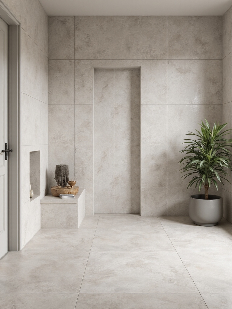
Before you fall for any tile, decide how the floor and walls will relate, because that relationship is the whole game. Harmony comes from a few simple rules I check on every project. Get these right and almost any two tiles can live together:
- One leads, one supports. Pick a hero surface and keep the other quiet so they do not compete.
- Share a thread. A repeated color, undertone, or material ties the two surfaces together.
- Add contrast in scale or texture, not in loudness, so the pair has depth without a clash.
Serene Light and Soft Elegance
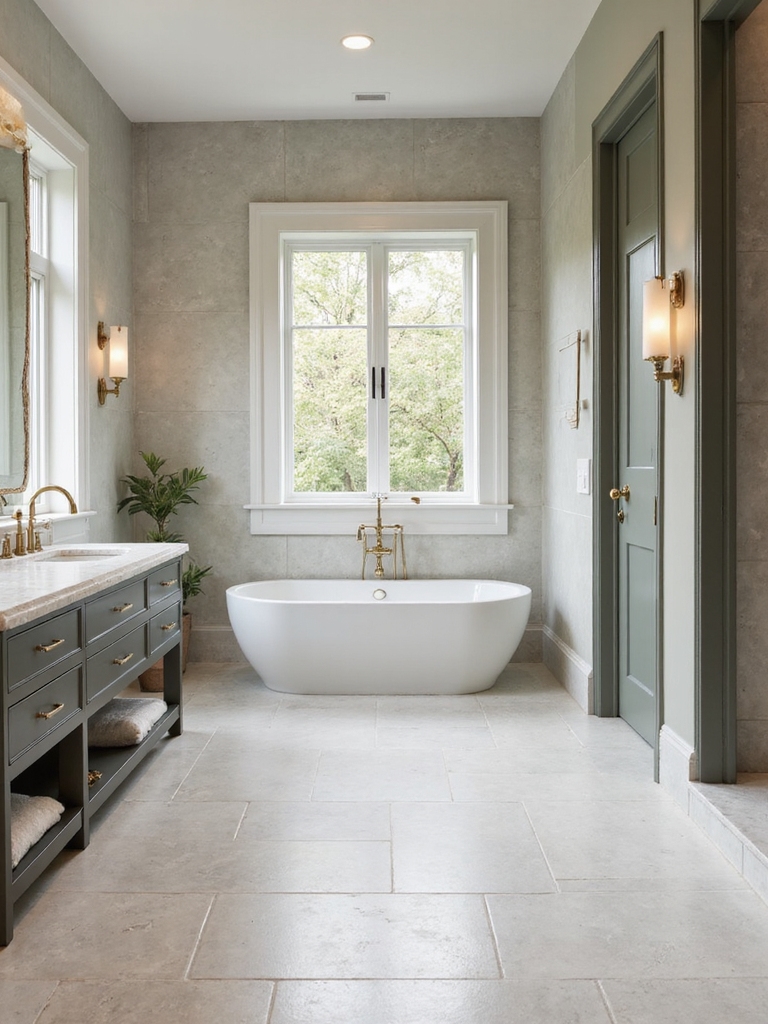
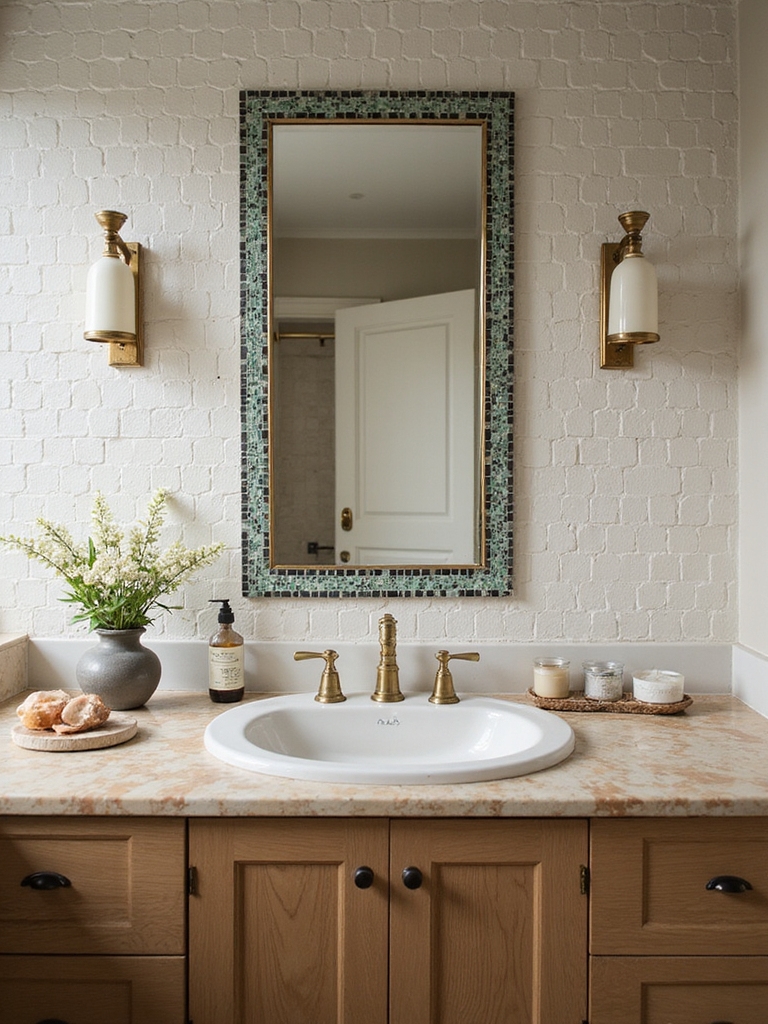
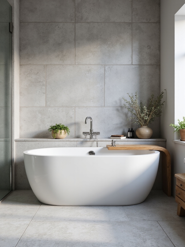
The easiest harmony to live with is a soft, light pairing where floor and walls stay in the same gentle family. Keeping both surfaces pale and warm makes a small bathroom feel open and a spa-calm that never dates. The move is letting subtle differences in tone and texture do the work without leaning on color. Here is how to keep it serene:
- Pair a warm white wall with a soft greige or pale stone-look floor for a quiet blend.
- Vary the finish, a matte floor under glossy wall tile, so the pair has gentle depth.
- Keep the grout close in tone so nothing chops up the calm; plan it like any color-by-mood scheme.
🅰️Bold wall, neutral floor
The easiest statement pairing. The wall is the star, the floor grounds it, and they share one undertone. Forgiving and high-impact.
🅱️Monochrome, head to toe
The foolproof harmony. One color family on both surfaces, with texture and scale for interest. Calm, enveloping, and impossible to clash.
Bold Walls With Neutral Floors
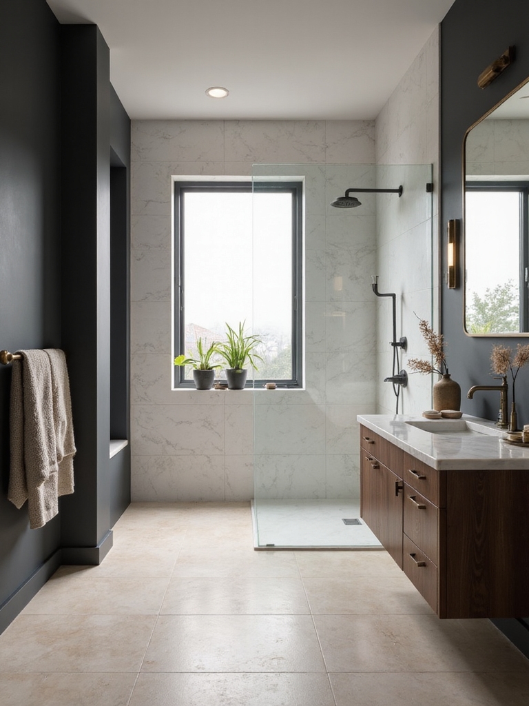
When you want a statement, the cleanest way to keep harmony is to let the wall be bold and the floor stay neutral. A patterned or colorful wall tile becomes the room’s focal point, while a quiet floor grounds it and gives the eye a place to rest. Two bold surfaces would fight; one bold, one calm is what looks designed.
The neutral floor still has to belong to the wall. Pull one color from the wall tile into the floor, even a faint undertone, so the two clearly come from the same story. A warm-toned patterned wall wants a warm neutral floor; a cool one wants a cool floor. That shared undertone is the thread that keeps a bold pairing in harmony.
- Make the wall the hero with pattern or color, and keep the floor quiet.
- Pull one shared undertone from the wall into a neutral floor.
- Echo the wall color in a towel or accent so the room feels tied together.
A Cohesive Monochrome Scheme
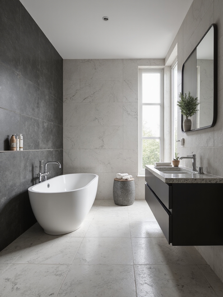
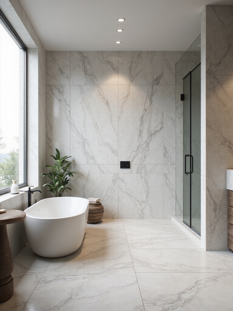
A monochrome scheme is the foolproof harmony. Floor and walls share one color family and simply cannot clash. Running the same tone from floor to walls wraps a bathroom in a calm, enveloping feel and makes a small room look bigger by blurring the edges. The interest comes from texture and finish, with color staying quiet, which keeps it from feeling flat. These black-and-white tile pairings show the monochrome idea at its sharpest.
- Keep floor and walls in one color family for guaranteed harmony.
- Add depth with different finishes or tile shapes in the same tone.
- Vary the scale, like a large wall tile over a small hex floor, to avoid monotony.
The tile pairings that fail are rarely about ugly tile. They are about two surfaces that either fight for attention or ignore each other completely.
Balanced Textures for Depth
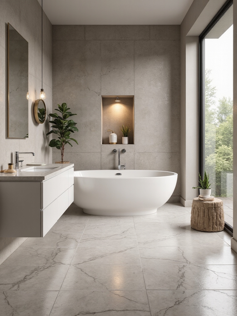
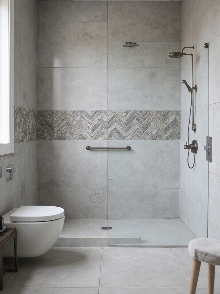
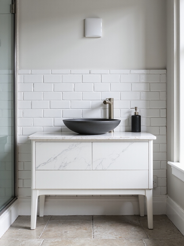
When the colors agree, texture is what gives a tile pairing depth and stops it from feeling flat. I balance a smooth surface against a tactile one, so a glossy subway wall sits over a matte stone-look floor, or a fluted wall tile pairs with a clean, simple floor. The eye finds richness even when the palette stays quiet.
One Textured Surface, One Calm One
The rule is to vary the texture but not pile it on. One textured surface and one calm one is the harmonious balance; two busy textures fight just like two bold colors. Let the more tactile tile be the feature and keep its partner simple, and the room feels layered and rich. That balance is the whole goal.
Match the texture to the spot, too. A slightly textured floor tile adds grip where a glossy one would be slick when wet, which is a safety bonus as well as a design one. For more on dimensional tile, these luxe tile combinations lean into texture beautifully.
Match the Grout and the Scale
Two details quietly make or break tile harmony: the grout and the scale. Grout is the line work of a tiled room, so a grout that matches the tile lets a surface look like one calm plane, while a contrasting grout draws every edge and adds graphic energy. I tell every client to pick grout on purpose, since the same tile feels completely different with a matching versus a contrasting line.
Coordinate the grout between floor and walls so they belong together. Using a similar grout tone on both surfaces is a subtle thread that ties the pair into one room. A wildly different grout color on each surface is one of the quiet reasons a tile pairing feels off even when the tiles themselves are lovely.
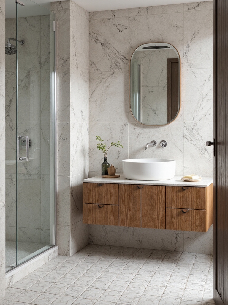
Scale is the other lever. Varying the tile size between floor and walls, a large-format wall over a small mosaic floor, gives a harmonious pairing contrast and rhythm. Matching the scale exactly on both surfaces can feel flat, so a deliberate size difference keeps the eye interested while the shared color holds it together.
Mixing Patterns Without Clashing
Mixing a patterned tile with a plain one is where harmony gets exciting, and it has one rule: vary the scale and share a color. A bold patterned floor under plain walls, or a graphic wall over a simple floor, works when the pattern pulls its colors from its quiet partner. Two patterns can even coexist if one is large and one is small and they share a palette.
Keep the loud one contained and let it breathe. A patterned tile looks best as a defined area, the floor, a shower wall, a niche. Give it edges. Surround it with calm tile and a tight palette, and a bold pattern becomes the star with the room calm around it.
- Pair a patterned surface with a plain one that shares its colors.
- Vary the scale, large with small, so two patterns can coexist.
- Contain the pattern to one area and surround it with calm tile.
Carry the Harmony Into the Whole Room
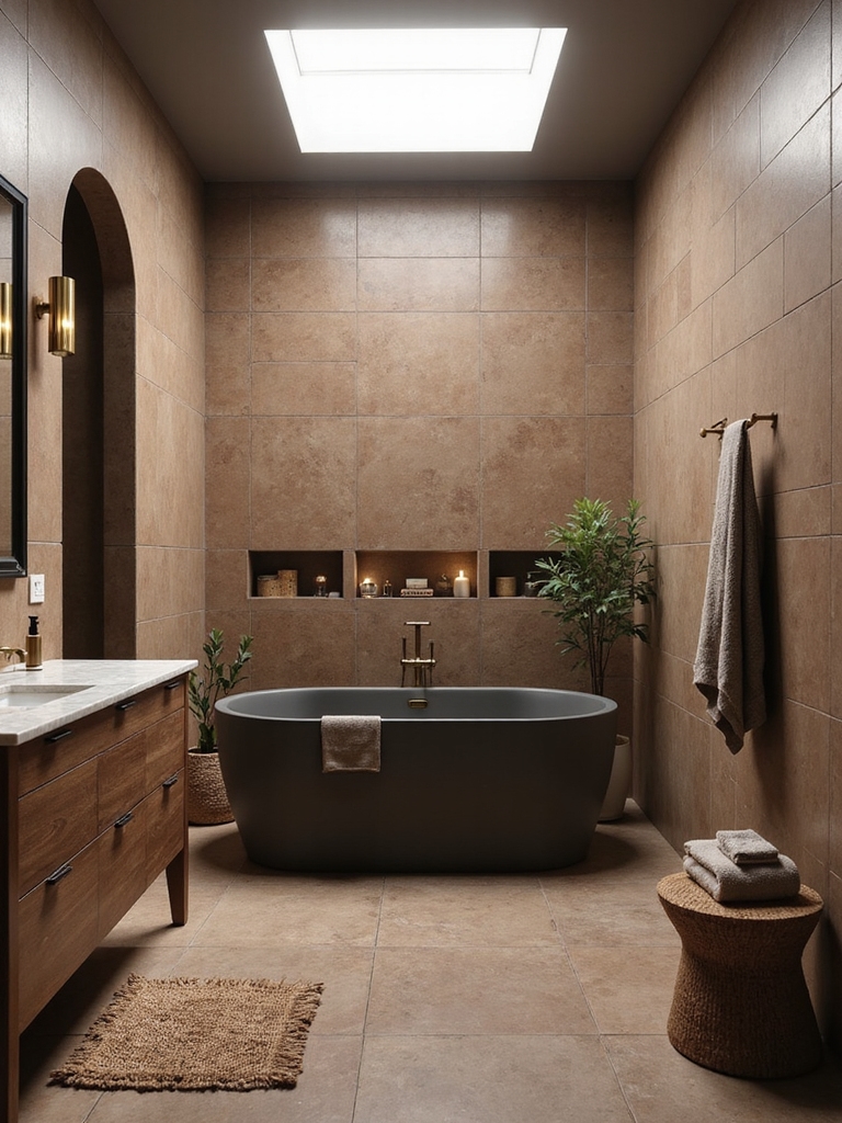
Floor and wall tile do not live in a vacuum, so true harmony pulls the fixtures and finishes in too. I tell every client to choose the vanity, the metals, and the paint after the tile, so everything answers to one palette. When the brass faucet picks up a warm tile undertone and the vanity color sits in the same family, the whole bathroom feels composed and deliberate.
Let the tile set the temperature for the room. A warm, earthy tile pairing wants warm wood and brass around it, while a cool gray-and-white scheme calls for chrome or matte black and crisp white. Matching the metal and wood tones to the tile’s undertone is the quiet move that makes a room feel finished.
Pull a tile color into the soft elements to seal the harmony. A towel, a bath mat, or a shade of paint that echoes one tone in the floor or wall ties the tiled surfaces to the rest of the room. Clients ask me why a beautifully tiled bath still feels slightly off, and the answer is usually that the fixtures and color never joined the tile’s conversation.
Common Tile-Pairing Mistakes
The biggest harmony mistake is choosing two heroes, a bold floor and a bold wall that both demand attention and end up shouting over each other. Pick one to lead and quiet the other, and the room instantly calms down. The second common slip is ignoring undertone, pairing a warm tile with a cool one so they sit together but never quite agree.
The other traps are mismatched grout and identical scale. A clashing grout chops the surfaces apart, while matching the tile size exactly on floor and walls falls flat. Share a thread, vary the scale, pick grout on purpose, and let one surface lead, and a floor-and-wall pairing falls into harmony almost on its own. Always order a sample of each and tape them up together before you commit.
What to Expect
Setting expectations keeps a tile project on track. Tile itself runs widely, roughly $5 to $20 a square foot for most porcelain and ceramic, and the harmony costs nothing extra; it is all in the pairing choices you make for free. The real spend is labor, so getting the pairing right before installation matters most.
Plan to live with samples before you buy. I always tape a piece of each tile up together, on the actual wall and floor, and look at them morning and night, since lighting shifts how two tiles relate. An hour with samples saves you from a pairing that looked great in the store and fights in your own bathroom. Seal the grout once installed and the harmony holds for years.
Floor and Wall Tile Questions, Answered
?Should bathroom floor and wall tile match exactly?
No, exact matching usually falls flat. Harmony comes from a shared thread plus some contrast, so keep one color or undertone in common but vary the scale, texture, or finish. Floor and walls in the same tone but different sizes or finishes read far more designed than two identical surfaces.
?How do I pair a bold tile without it clashing?
Let it lead and keep its partner quiet. Put the bold pattern or color on one surface, usually the floor or one wall, and pair it with a plain tile that shares one of its colors. Two bold surfaces fight; one bold and one calm, tied by a shared undertone, stays in harmony.
?Does grout color matter for floor and wall tile harmony?
Yes, more than people expect. Matching grout lets a surface look like one calm plane, while contrasting grout draws every edge for graphic energy. Coordinate a similar grout tone across floor and walls so they belong together; a wildly different grout on each is a common reason a pairing feels off.
Pair Them, Do Not Just Pick Them
Floor and wall tile in harmony comes down to the relationship, not the individual tiles. Let one surface lead and the other support, tie them with a shared color or undertone, vary the scale or texture for depth, and pick grout on purpose. Do that and even modest tile pairs into a bathroom that looks designed and calm.
Before you buy, tape a sample of each tile up together in your own light and live with the pairing for a day. Bookmark this for the moment you stand in the tile aisle, since the harmony is decided in how the two surfaces talk, not in how pretty each one looks alone.