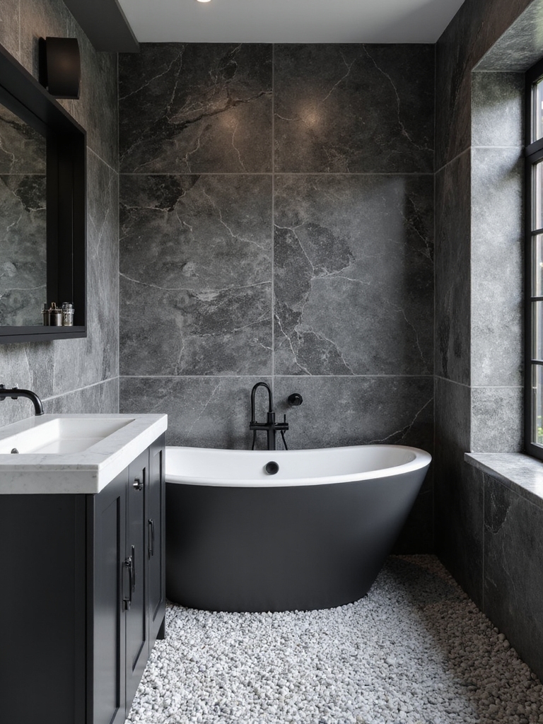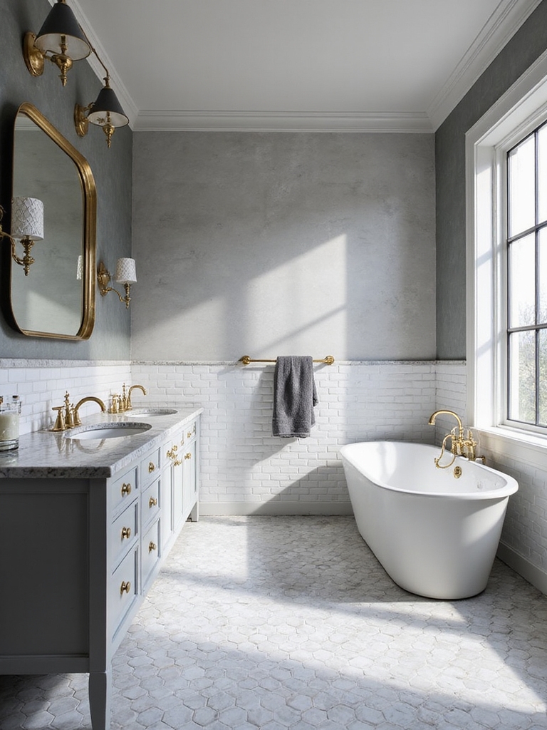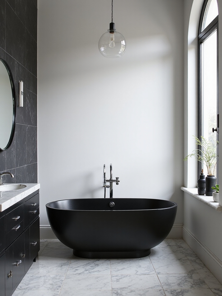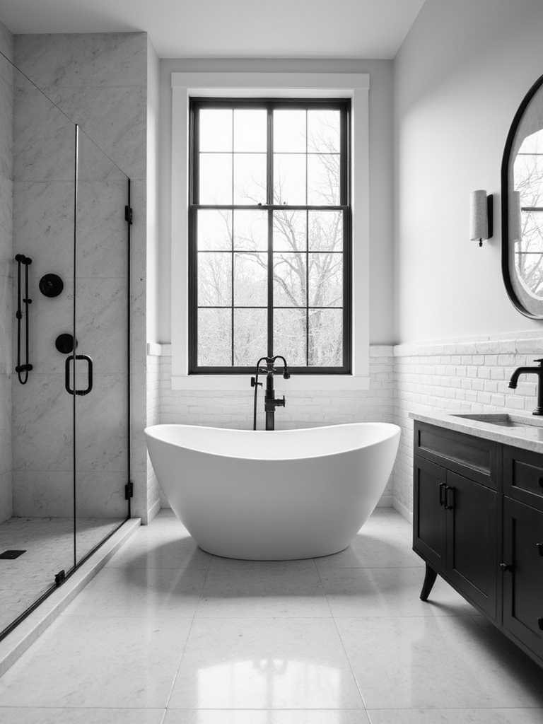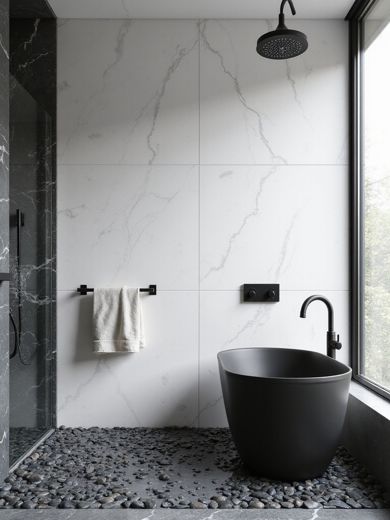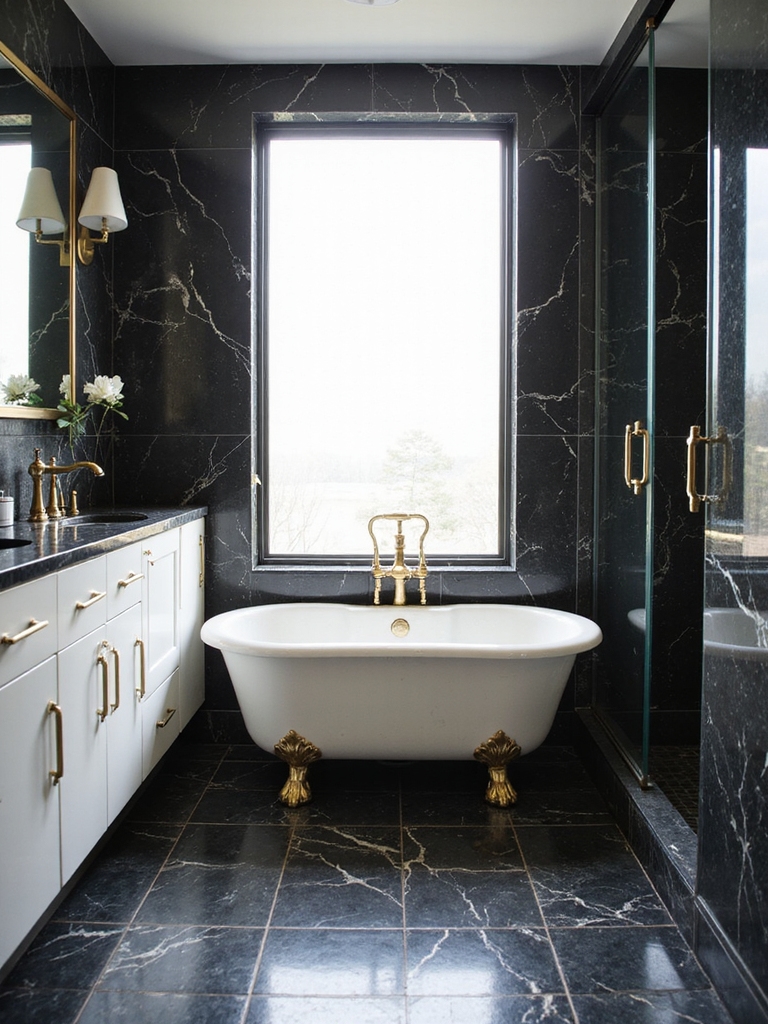

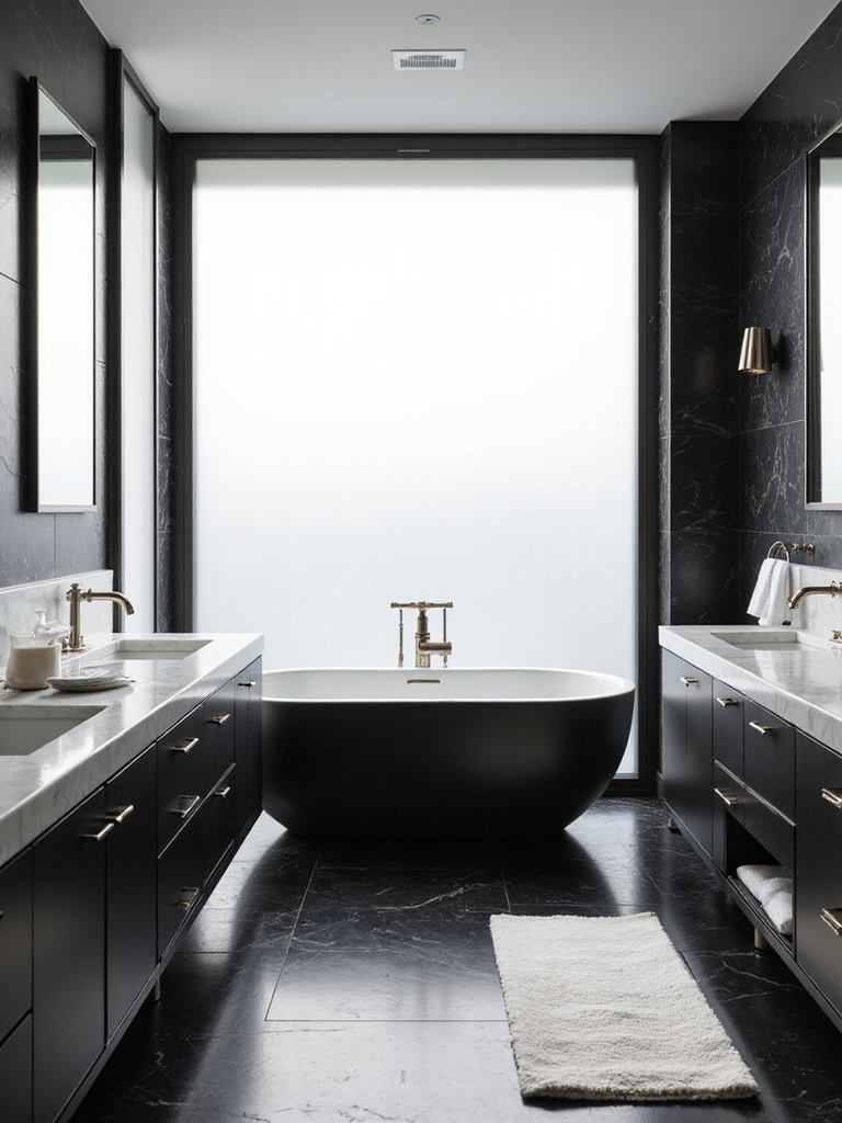
Black and white is the bathroom palette that has outlasted every trend, and there is a reason designers keep coming back to it. Done well, it looks crisp, expensive, and impossible to date. Done carelessly, it turns into a chessboard. The whole game is in three things the pros get right and most people miss: the ratio of black to white, the warmth you layer in, and how you light it.
These 16 black and white bathroom decor ideas pull from the choices working stylists actually make day to day. Below you will find the ratio rule that keeps the look chic, the textures that stop it from going cold, graphic tile that anchors a room, and the lighting that makes the contrast sing. Most of it is about restraint, which is exactly why it always looks high-end.
The Designer Approach, in Short
- Get the ratio right: lead with white, ration the black to roughly 70/30, and the room stays light and chic.
- Layer in warmth, wood, brass, soft texture, so the monochrome reads inviting, not sterile.
- Let one graphic tile be the star and keep everything around it quiet.
- Light it with warm bulbs so the whites stay creamy and the blacks stay rich.
Timeless Contrast: Why Black and White Works
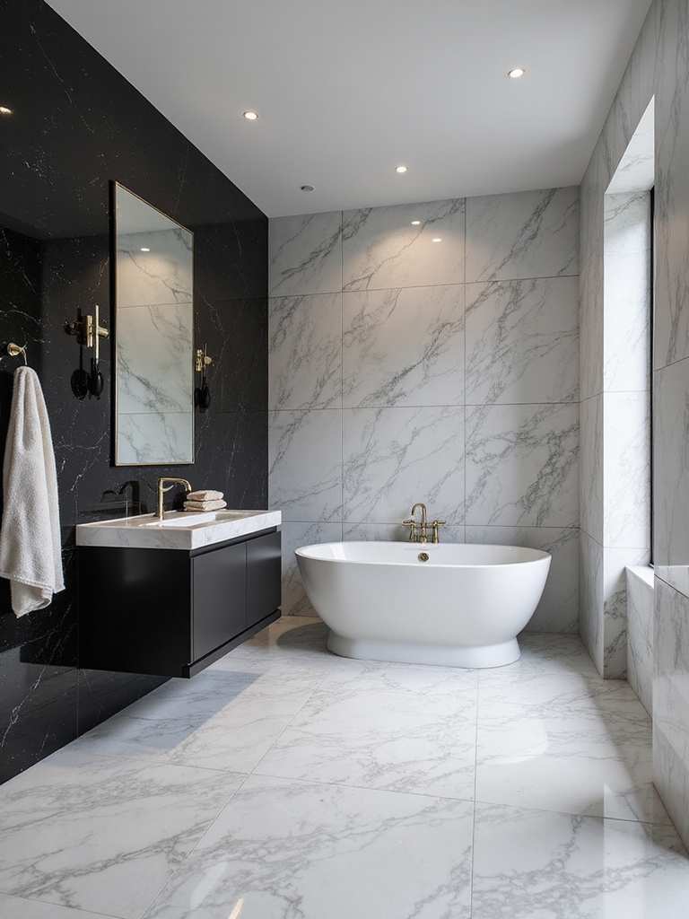
Black and white endures because it is a lasting discipline. The baths I design in this palette lean on contrast to do the work, so the room feels deliberate with very few moving parts. That is also why it photographs well and ages slowly. Here is what makes the palette so reliable:
- It never dates. A high-contrast bath from decades ago still looks current today.
- It is forgiving on budget. Most of the drama comes from cheap tile and hardware, not luxury materials.
- It flatters any size. Light-led white keeps a small bath open; black grounds a large one.
Bold High-Contrast Tile Patterns
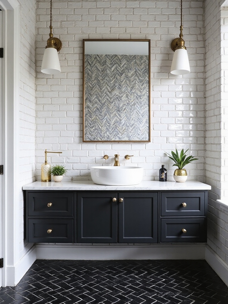
Tile is where a black and white bath earns its drama, and the floor is the easiest place to be bold. A classic checkerboard, a penny-tile field, or a hex pattern turns the floor into the room’s signature without a single accessory. I let the tile be loud and keep the walls quiet, because two competing patterns in one small room fight each other. A bold floor tile runs about $5 to $15 a square foot, the cheapest drama in the room.
Grout is the quiet design decision people overlook. A dark grout with white tile sketches the pattern in sharp lines, while a matching grout softens it into a calmer field. Pick the grout on purpose, since it changes the whole personality of the same tile. For more pattern inspiration, these floor tiles worth obsessing over suit the palette beautifully.
- Put the boldest pattern on the floor and keep walls simple to balance it.
- Use dark grout to emphasize a graphic pattern, or matching grout to soften it.
- Stick to one statement tile per room so the contrast stays sharp, not busy.
| Room | Lead color | Where the black goes |
|---|---|---|
| Small or windowless | White dominant | Hardware, mirror frame, grout lines |
| Medium | White with black floor | Floor tile plus hardware |
| Large or dramatic | More black allowed | Vanity or a feature wall |
Add Warmth to Black and White
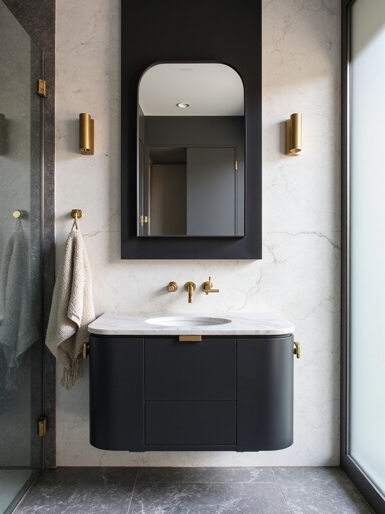
The warmth is the part most people forget. It is what separates a chic bath from a cold one. Pure black and white can feel clinical on its own, so I always layer in something warm to soften it. Clients are always surprised how much a single wood tone thaws the whole room. A wood vanity, a brass faucet, an oak stool, or a rattan basket brings life to the scheme without breaking the palette.
Texture does the same job through touch. Velvety towels, a linen-look rug, a nubby bath mat, and matte finishes against glossy tile add depth you can feel. The room stays monochrome but stops feeling flat, because the materials are doing the talking where the color stays quiet.
Greenery is the cheapest warmth of all. A single trailing plant or a eucalyptus stem pops against a black and white backdrop and instantly makes the room feel alive, which is why I almost never finish a monochrome bath without tucking at least one living thing somewhere in the frame. One warm metal, one wood tone, and one plant are usually all it takes to keep the palette from going austere.
Lighting Tricks for Monochrome Surfaces
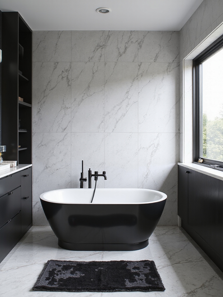
Lighting can make or break a black and white bath. Cool light turns the whites gray and the blacks muddy. Warm light keeps the whites creamy and the blacks rich, which is exactly what the palette needs. Here is how I light a monochrome room:
- Use warm 2700K to 3000K bulbs so whites stay soft and blacks stay deep.
- Add a backlit or sconce-lit mirror for even, flattering light on faces.
- Put it on a dimmer so the contrast can read crisp by day and moody at night; sort fixtures by lighting tone first.
Good to Know
Bulb color temperature quietly changes a monochrome bath. Warm bulbs (2700K to 3000K) keep whites looking creamy and blacks looking rich, while cool bulbs (4000K and up) turn whites gray and flatten the blacks, draining the contrast you worked for.
Bold, Minimal Fixtures That Command the Space
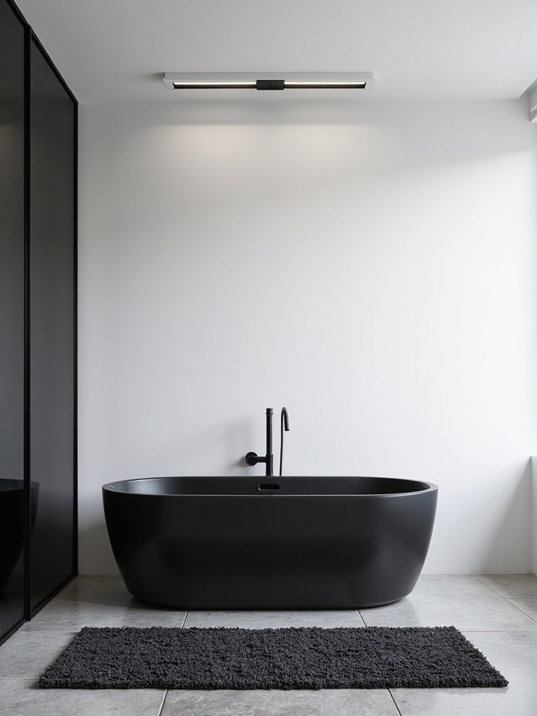
In a black and white bath, the fixtures get to be sculpture, because the quiet palette gives them room to stand out. A matte black faucet against a white sink, a single statement light, or a wall-mounted basin becomes a design feature in its own right. Matte black hardware runs about $15 to $40 a piece, and swapping it is the fastest way into the look. Minimal here means every piece is chosen and deliberate.
Commit to One Metal Finish
Pick one metal and commit to it across the room. Matte black sharpens a crisp white scheme, while warm brass softens it and adds that hint of warmth the palette wants. Repeating a single finish on the faucet, hardware, and lighting is what makes the room look designed, like a pro planned every piece.
Keep the silhouettes clean so the contrast carries the drama. A sculptural faucet or a slim black frame does more in this palette than a fussy, ornate piece ever could. Let the lines stay simple and the black and white do the heavy lifting.
Graphic and Matte-Black Power Pairings
Once the bones are set, a few signature pairings push a black and white bath from nice to editorial. Matte black hardware against glossy white subway tile is the classic, and it costs almost nothing to pull off with a hardware swap. The matte-against-gloss texture play is what gives the combo its richness.
Graphic accents are the other power move, used sparingly. A black-framed mirror, a striped Roman shade, or a single band of patterned tile adds personality while keeping the palette strict. I treat these like punctuation, one or two strong marks in a room, never a paragraph of them.
The trick to going graphic is a quiet backdrop. Bold shapes need calm around them, so I pair a statement element with plain white walls and simple fixtures. Borrow a few ideas from these luxe tile combinations and let one bold gesture carry the room.
Mirrors and Careful Color Accents
A big mirror is a black and white bath’s best friend, since it bounces the light a monochrome room needs and doubles the graphic impact of your tile. A black-framed mirror doubles as an accent, while a frameless one keeps things airy in a small space. Either way, place it opposite your best light to brighten the whole room; these mirror ideas worth copying translate cleanly to the palette.
If you crave a little color, the rule is to keep it tiny and removable. A single muted accent, sage, blush, ochre, in a towel or a plant pot warms the scheme without breaking it. Keeping color to accessories means you can change your mind anytime and the black and white bones still hold.
- Hang a large mirror opposite the light to brighten and double the contrast.
- Keep any color to small, swappable accents like a towel or a plant pot.
- Choose a black frame for an accent or frameless to keep a small bath open.
Getting the Black-to-White Ratio Right
If there is one rule that separates a designer black and white bath from a DIY miss, it is the ratio. The baths that fail are almost always the ones with equal amounts of black and white, which looks busy and restless.
What I tell every client is to lead with white and ration the black to roughly thirty percent, so the room stays light and the black lands as deliberate punctuation. Clients ask me about this ratio more than anything else in a monochrome bath, because getting it even slightly wrong is what tips a chic, gallery-clean room into a restless checkerboard you cannot relax in.
Decide which color leads based on the room. A small or windowless bath wants white dominant with black accents to stay open and bright, while a large or dramatic room can carry more black on a vanity or a feature wall. The minority color should feel chosen, placed in just two or three intentional spots around the room.
Plan the ratio before you buy anything, the same way you would map any color-by-mood scheme. Sketch where the black goes, the floor, the hardware, the frame, and leave the rest light. Get the proportion right and even a tiny budget reads like a designer did it.
Keeping a Black and White Bath Sharp
A black and white bath shows everything, which is its charm and its upkeep. White surfaces reveal grime and black ones show water spots and dust, so a quick two-minute wipe twice a week keeps the contrast crisp. In my own bath I keep a microfiber cloth handy and hit the black fixtures after showers, since hard-water spots stand out most on dark finishes.
Grout is the long-term job in a high-contrast bath. White grout grays over time and dark grout can fade, so I seal grout about twice a year and refresh caulk when it discolors. A little maintenance is the price of a palette this crisp, and it is what keeps the look reading expensive for years.
Black and White Bathroom Questions, Answered
?How do I keep a black and white bathroom from looking cold?
Layer in warmth. A wood vanity or stool, a brass or warm-metal faucet, soft textured towels, and a single plant all soften the contrast and keep the room inviting. Warm lighting in the 2700K to 3000K range matters too, since cool light is what makes a monochrome bath feel clinical.
?What is the right ratio of black to white in a bathroom?
Lead with white and keep black to roughly thirty percent for most rooms. Equal amounts tend to look busy and restless. In a small or windowless bath, go even more white-dominant with black as accents; in a large room, you can carry more black on a vanity or feature wall.
?Is a black and white bathroom hard to keep clean?
It shows more than most palettes, but the upkeep is simple. White surfaces reveal grime and black finishes show water spots, so a quick wipe a couple of times a week keeps it crisp. Seal grout about twice a year, and the high-contrast look stays sharp and gallery-clean.
Restraint Is Why It Always Looks Expensive
A black and white bathroom that designers love comes down to a few disciplined choices: lead with white and ration the black, layer in real warmth, let one bold tile or fixture be the star, and light it warm so the contrast stays rich. None of it is expensive, and all of it is about restraint, which is exactly why the look reads so high-end.
Start with the ratio, because that one decision shapes everything else, then add warmth so the room never goes cold. Whether you go all-in on graphic tile or just swap to matte black hardware, the palette rewards a careful hand. Get the ratio right, warm it up, and your black and white bath will still look sharp long after this year’s trends have moved on.