I’ll guide you through a calming grey-green bathroom, balancing cool greys with mossy greens for a quiet retreat. Start with cool, warm, or olive undertones, using about 60/40 or 70/30 for harmony. Choose misty greys with botanical tile accents, warm grays for grout, and matte textures like ceramics with plush towels. Add soft-green cabinetry and strategic greenery to soften surfaces. If you keep to cohesive finishes and thoughtful light, serenity follows—and there’s more to uncover as you continue.
Why a Grey-Green Palette Creates a Calming Bathroom Retreat
A grey-green palette soothes the mind and makes a bathroom feel like a quiet retreat.
I’ve found this combination reduces visual noise, inviting focus and rest. The cool greys balance warmth from greens, supporting subtle contrasts that prevent starkness.
With natural textures and a simple finish, your space becomes calm, practical, and timeless—easy to maintain, endlessly comforting.
Incorporating modern neutral bathroom inspirations can enhance this calming effect and create a serene, inviting atmosphere.
Foundations: Choosing Your Grey and Green Palette for Calm
Choosing a grey-green palette starts with pairing cool grays with soft greens for a serene base.
I’ll explore the right Gray-Green Tone Pairings and how Calm Contrast Techniques can keep the space balanced, not flat.
Let’s discuss practical choices that affect mood, lighting, and the sense of calm you want in your bathroom.
Incorporating elements from timeless green and white bathroom designs can enhance the clean, classic vibe of your space with fresh, natural accents.
Gray-Green Tone Pairings
When selecting a gray-green palette, I start with the undertone that best suits the space: cool, warm, or olive.
Then I balance tones with proportion: 60/40, or 70/30 for a calmer feel.
Pair muted greens with soft grays, add a crisp white for contrast, and keep fixtures simple.
Subtle shifts create serenity without fuss.
Calm Contrast Techniques
Calm contrast starts with restraint: I pair the same cool or warm undertone of gray with a complementary green, then introduce contrast through light and texture rather than with color alone.
I use matte surfaces, varied textures, and natural light to keep calm without shouting color.
- Subtle patterns on towels and tiles
- Textured fabrics for depth
- Matte hardware to soften sheen
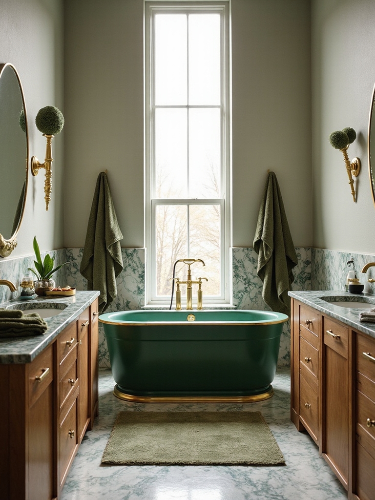
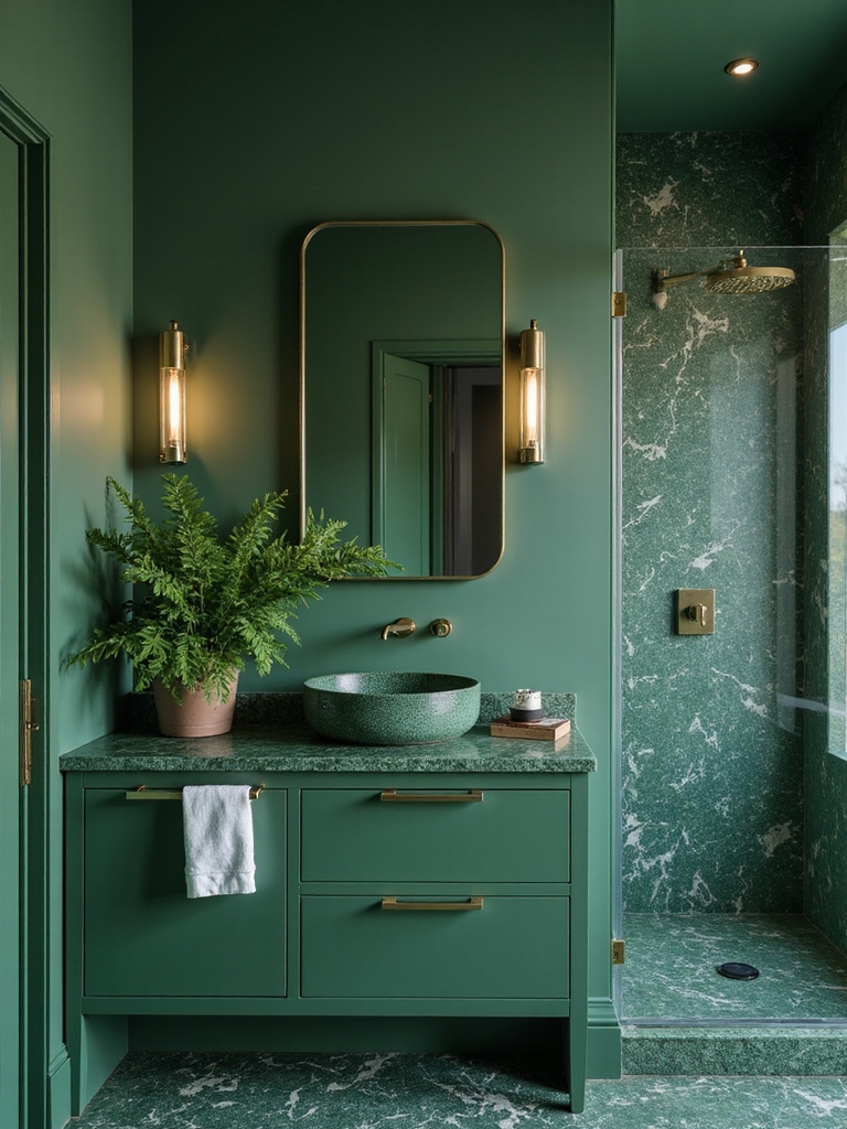
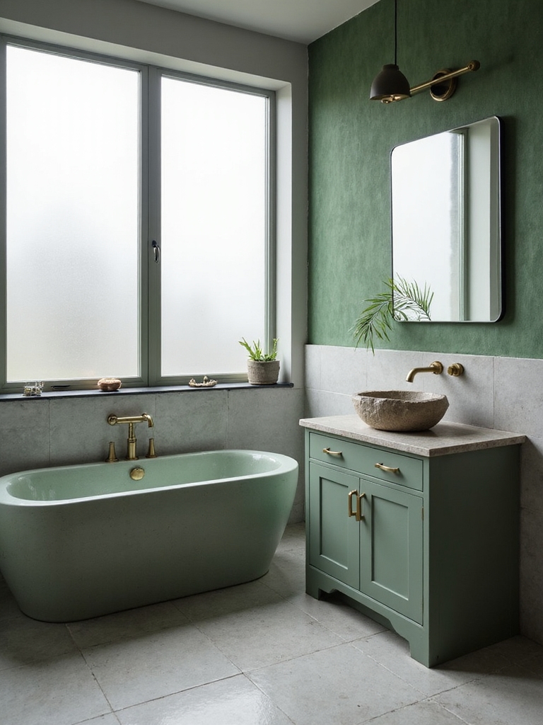
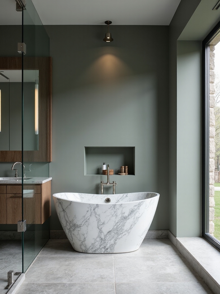
Soft Grey Walls With Mossy Green Accents: Color Pairings and Balance
Soft grey walls form a soothing backdrop, while mossy green accents bring nature indoors and anchor the space with earthy energy.
I pair muted greens with warm whites and charcoal details to maintain balance.
Use matte finishes and natural textures—linen, wool, stone—for depth, then keep hardware simple.
Stay restrained: let color contrast guide focal points without shouting.
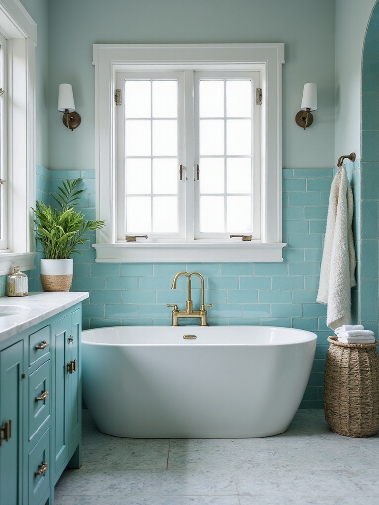
Misty Greys With Botanical Tile Highlights: Tile Shapes and Grout Choices
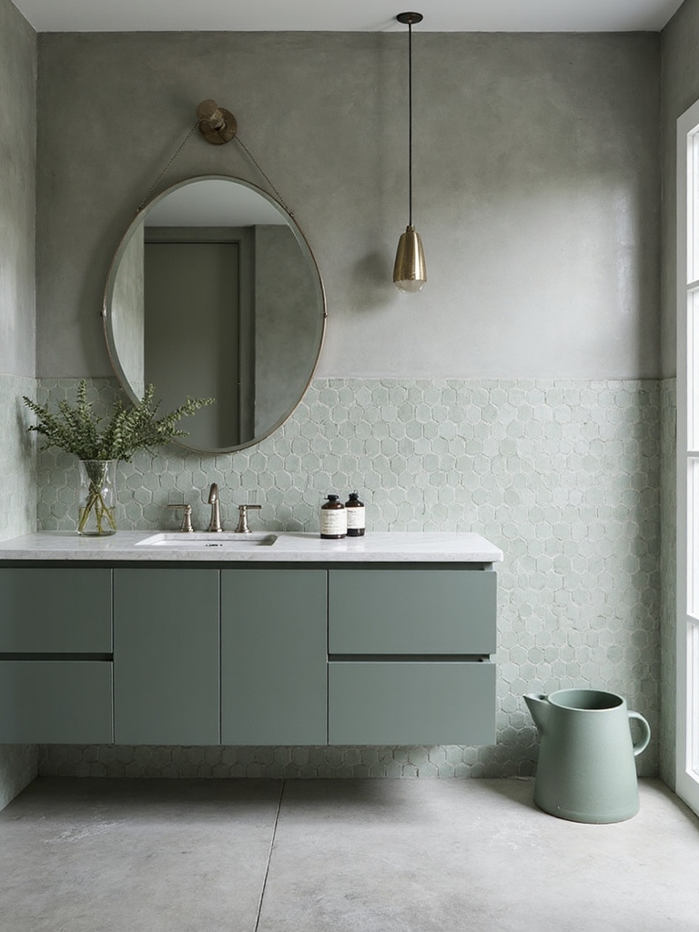
I’m exploring how misty greys pair with botanical tile highlights, starting with tile shapes that keep the space calm and cohesive.
I’ll weigh grout color options that either blur boundaries for serenity or subtly define patterns to highlight the Misty Grey accents.
We’ll consider how each choice—tile shapes, grout tones, and misty grey cues—shapes the overall calm of your retreat.
Incorporating trendy gray bathroom tile inspirations can elevate your design by blending modern aesthetics with soothing tones.
Tile Shapes Guide
Tile shapes set the tone as surely as color does, guiding how light moves and how the space feels. I embrace shapes that echo calm—rectified edges, gentle curves, and modular grids—so botanical accents breathe without clash.
My choices balance scale with grout, favoring cohesion over ornament.
- Proportional tile sizing to room dimensions
- Subtle alternating patterns for texture
- Narrow grout for seamless unity
Grout Color Options
Grout color can unify or highlight the botanical tile, so I choose neutrals that soften the contrast and let texture take center stage.
I favor warm grays or off-whites, lightly sanded or cement-like finishes, to keep lines clean and timeless. A midtone grout balances mossy greens, while lighter shades reveal delicate details without overpowering the tiles.
Practical, refined, enduring.
Misty Grey Accents
- Tile shapes: small hexes or elongated rectangles for gentle rhythm
- Grout: lighter than tile to enhance airiness
- Pattern: restrained repeats, mindful spacing
Texture and Touch: Matte Ceramics Paired With Plush Towels
Texture and touch take center stage in a calm bathroom, where matte ceramics invite a subtle, tactile quiet and plush towels provide a warm counterpoint.
I notice how the matte surfaces resist glare, while thick cottons yield immediate softness. The combination feels calm yet purposeful, inviting careful use; I choose simple lines, neutral hues, and a tactile rhythm that supports daily, mindful routines. To enhance this serene environment, selecting floor tiles that maximize space can visually open up the bathroom, creating an even more inviting retreat.
Material Choices for Calm: Sustainable Options Like Bamboo and Cork
Sustainability guides my material choices for a calm bathroom, and bamboo and cork stand out as practical, stylish options.
I favor surfaces that balance durability with warmth, ensuring easy upkeep and low environmental impact. By selecting renewables, I keep textures tactile yet restrained, letting light and color lead the mood.
- Bamboo vanity: resilient, water-resistant, refined
- Cork flooring: quiet underfoot, sustainable, soft
- Recycled glass accents: clean lines, subtle sheen
Incorporating a green bathroom vanity can also revamp your morning routine with style and freshness.
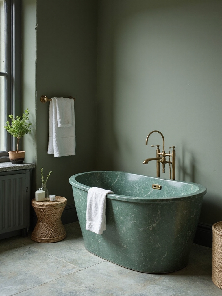
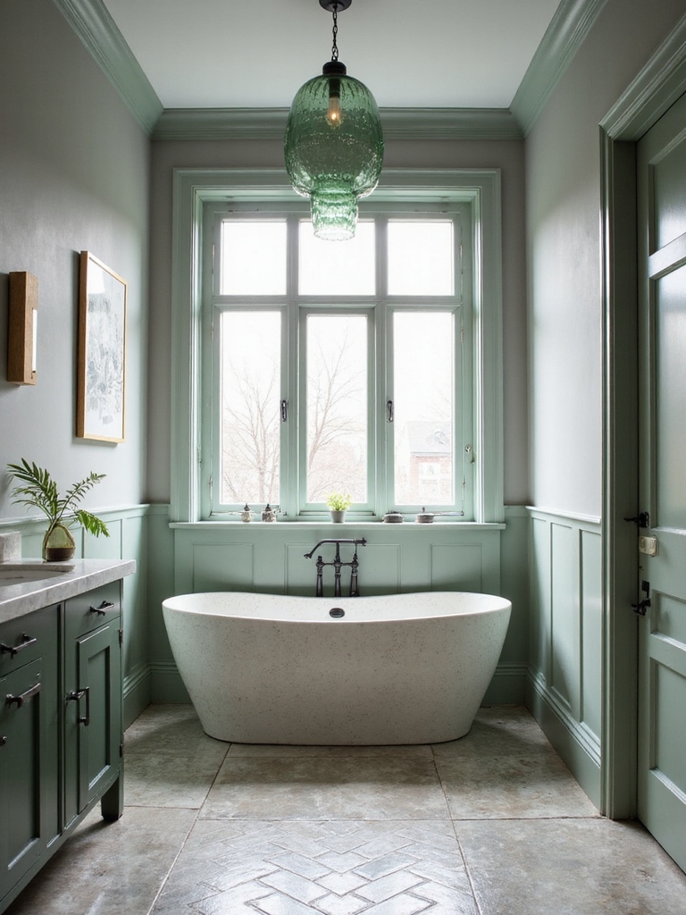
Natural Wood Warmth Against Cool Green Palettes
Natural wood brings a grounding warmth that counterbalances cool green palettes with quiet confidence.
I pair smooth, sanded planks with subtle grain to echo nature and keep the room cohesive.
You’ll notice how light-absorbing tones soften stark greens, while warm undertones invite calm.
I suggest simple shelving, a wood-framed mirror, and practical storage that stays timeless and serene.
For a truly refreshing atmosphere, incorporating sage green bathroom decor adds a charming and soothing touch.
Finishes That Reinforce Tranquility: Hardware, Faucets, and Surfaces
Finishes can quietly transform a bathroom into a tranquil retreat. I choose hardware, faucets, and surfaces with intention, prioritizing soft textures and timeless silhouettes that resist trend.
Subtle metallics, matte finishes, and cool neutrals blend with green accents to cultivate calm, while durable materials guarantee lasting serenity.
- Soft, brushed metals with warm undertones
- Matte porcelain and stone-inspired surfaces
- Clean lines, minimal detailing, integrated hardware
Incorporating elements from modern luxury bathroom design ideas ensures your space feels both elegant and peaceful.
Greenery Placement Ideas to Boost Calm and Freshness
I’ll start by sharing how Strategic Plant Placement can anchor a calm bathroom, with each plant chosen for scent, scale, and light needs.
Layered Green Textures add depth without clutter, mixing foliage sizes and leaf shapes for a soothing, cohesive feel.
Calming Color Pairings tie everything together, pairing soft greens with cool neutrals to boost freshness while preserving a serene mood.
Incorporating elements inspired by green bathroom ideas can help maintain a fresh and revitalizing atmosphere all year round.
Strategic Plant Placement
- Place near the sink for daily care ease
- Use trailing varieties to soften shelves
- Group in threes for cohesive focal points
Layered Green Textures
I guide you to mix leafier specimens with structured pottery, balancing height and density for visual relief.
Place ferns near mirrors, trailing ivies on shelves, and compact herbs on windowsills.
Emphasize natural light, clean lines, and minimal clutter to keep the space serene and functional.
Calming Color Pairings
Greenery again plays a central role, but now we pair calming greens with thoughtful color accents to reinforce a serene mood.
I guide you toward balanced palettes and deliberate contrasts that feel timeless, practical, and fresh. Together, we’ll highlight how color whispers calm without shouting.
- Use soft greens with warm neutrals for cohesion
- Introduce muted blues as accent notes
- Keep metallics restrained for polish
Subtle Lighting Strategies to Enhance Grey-Green Tones
Subtle lighting can transform grey-green tones from flat to inviting, so I’ll start by choosing fixtures that cast gentle, warm–neutral light across the room.
I’ll layer light with a dimmer, add task lighting near sinks, and keep glare low to preserve color fidelity.
Neutral metal finishes and frosted glass soften the mood, enhancing calm without shouting contrast.
In small bathroom spaces, optimizing lighting placement is crucial to maximize space efficiency and create a soothing atmosphere.
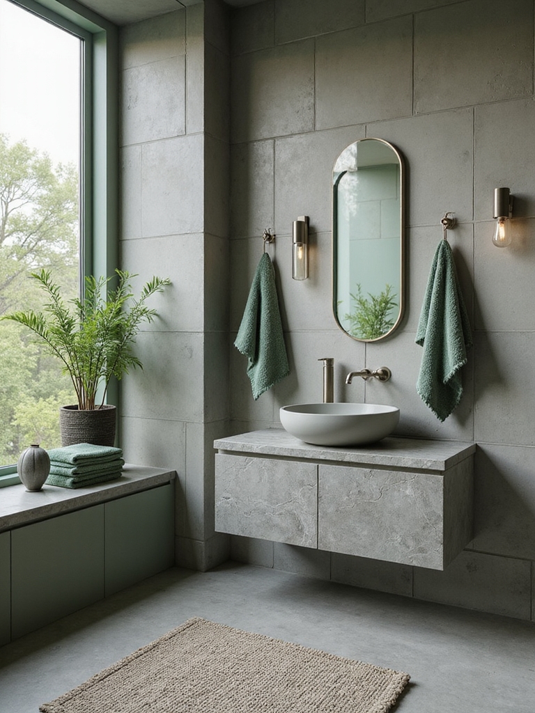
Texture Play: Textiles, Towels, and Rugs in Muted Greens
Muted green textiles bring a quiet harmony to the bathroom, balancing towels and rugs with layered textures that invite touch.
I’ll explore how fabric patterns and finishes—matte cottons, plush velvets, and ribbed weaves—work together for a calm, cohesive look.
We’ll consider pairing muted greens with subtle contrasts to keep the space serene and practical.
In small bathrooms, choosing green textiles can also help maximize every inch by adding style without overwhelming the space.
Muted Green Textiles Textures
Texture plays a pivotal role in a calming bathroom, and muted green textiles bring both softness and depth to the room.
I guide you toward restrained hues, tactile fabrics, and balanced contrasts that never overwhelm.
- Layered towels in olive and sage for subtle warmth
- Matte cotton rugs echoing forest floors
- Linen blends with muted sage accents for refined texture
Towels And Rugs Harmony
Towels and rugs form the backbone of a calming bathroom, and in muted greens they set a steady, nature-inspired rhythm.
I choose textures deliberately: plush towels for softness, flat-weave rugs for quiet grounding, and subtle contrast stitching for polish.
I favor moisture-wicking fibers, easy care, and coordinated tones that feel cohesive, calm, and timeless—never fussy or loud.
Layered Fabric Patterns
Moving from the calm foundation of towels and rugs, I’m turning to layered fabric patterns to add subtle depth without noise.
I combine muted greens, textures, and scale for visual rhythm. The result feels cohesive, grounded, and refined, inviting calm while avoiding busy contrasts that jar the senses.
- Subtle tonal multiples
- Varied textures, coordinated hues
- Balanced patterns, restrained contrast
Spa-Like Showers and Vanity Setups: Layouts That Feel Serene
A spa-like bathroom starts with thoughtfully planned showers and vanities that feel serene from the moment you enter.
I design layouts that balance water, light, and storage, so daily rituals feel effortless.
Think expansive shower niches, rainfall heads, and a floating vanity for easy cleaning.
Crisp lines, neutral tones, and strategic lighting create calm, practical spaces you’ll genuinely enjoy.
Accessory Picks for a Cohesive Look: Mirrors, Hardware, and Containers
When aiming for cohesion, selecting mirrors, hardware, and containers that share a unifying finish or tone makes the whole room feel intentional.
I choose understated metals, glass, and natural textures, letting their compatibility guide placement. This restraint yields calm, not clutter.
- Consistent metal finishes
- Simple, functional shapes
- Sculpted, organized containers
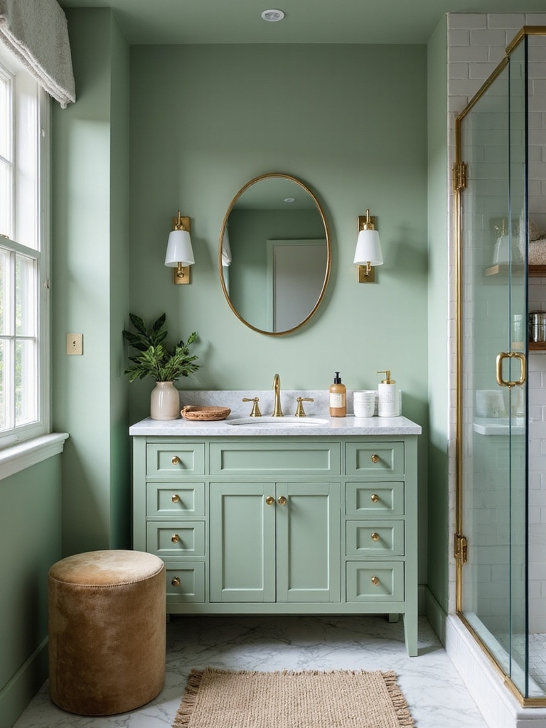
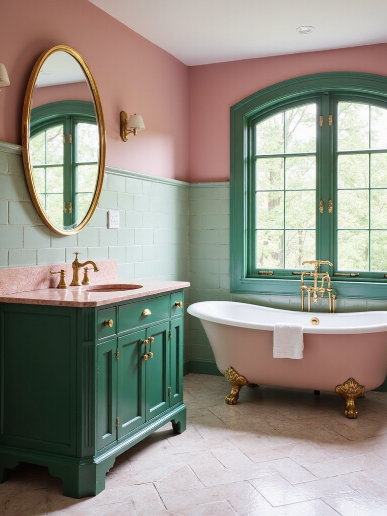
Painted Cabinetry: Soft-Green Tones Without Overpowering
Soft-green cabinetry can gently refresh a bathroom without shouting for attention.
I choose soft hues that read calm rather than loud, pairing them with white or warm neutrals to keep lines clean. A subtle satin finish prevents glare, while simple hardware keeps the look refined.
I advise mindful contrast: light walls, darker countertops, and uncluttered surfaces for lasting serenity.
Tile Patterns That Read Calm, Not Busy
Tile patterns can set a calm mood without making the room feel busy. I choose layouts that breathe—large tiles, subtle grout, and linear repetition.
Avoid bold diagonals or busy mosaics; opt for restrained rhythm that guides your eye. Here’s how:
- Prefer oversized formats with soft grout
- Use monochrome or tonal variations
- Align patterns with fixtures for cohesion
Color Balance in Practice: When to Lean Into Grey vs. Green
Choosing between grey and green isn’t about rules so much as mood.
I’ll guide you toward color balance by evaluating light, fixtures, and texture first, then deciding which hue leads. In practice, lean grey for cooling, mature spaces, and green to invite life.
Pair neutrals with crisp whites; let accent pieces draw the eye. Subtle shifts yield calm, not fatigue.
Small-Space Serenity Tricks and a Quick-Start Budget-Friendly Plan
When you’re working with a small bathroom, every inch counts, so I start with simple, practical steps that fit your budget.
I focus on smart layout tweaks, multiuse essentials, and a clear plan you can follow now.
- Declutter with a single “keep or donate” pass
- Add a mirrored medicine cabinet for storage and light
- Choose slimline fixtures and cohesive colors for visual expansion
Conclusion
I’ve learned that a grey-green bathroom can be a quiet, restorative retreat, where calm isn’t loud but present. I choose palettes with care, balance textures, and let soft greens soften cool greys. It’s like a gentle breeze through a quiet room—subtle, invigorating, enduring. If you start with foundations, you’ll see color do the heavy lifting without shouting. Trust the logic: practical choices, timeless looks, and a space that feels endlessly serene.