I’m here to show you how grey tiles can become a vibrant canvas, balancing calm neutrals with bold pops and smart textures. Start with warm greige or charcoal bases, then layer crisp whites, emeralds, or navy for real impact. Add jewel-toned accessories, mixed metals, and patterned textiles to keep the look lively without clashing. I’ll guide you through cohesive lighting and color planning so your space feels curated—and if you keep exploring, you’ll uncover even more inspiration.
Why Grey Tiles Make a Color Canvas
Grey tiles have a quietly powerful way of elevating a bathroom, acting as a neutral canvas that lets color pop and personality shine.
I see them as a stage for accents, where bold hues or soft tones mingle without clashing. They sharpen contrast, brighten spaces, and invite playful palettes.
With grey, every shade has room to breathe and bond. Adding vibrant touches can transform the space, creating a stylish and lively atmosphere that complements the grey backdrop with colorful accents.
How to Start Color Planning for a Grey Tile Bathroom
When you’re planning color for a grey-tiled bathroom, start with a simple triad: a dominant wardrobe of neutrals, a punchy accent hue, and a few soft textures to keep things warm.
I guide you to map surfaces first, then layer mood with fabric, decor, and lighting.
Keep contrast deliberate, repeat color sparingly, and test swatches in the room’s natural light.
Incorporating stylish bathroom inspirations featuring grey tiles can help you visualize how different color schemes bring the space to life.
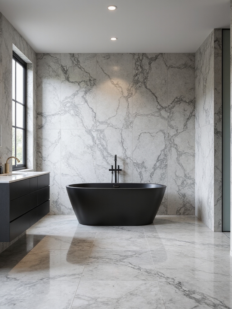
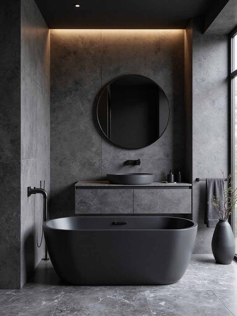
Moody Charcoal: Pair With Bold Accents
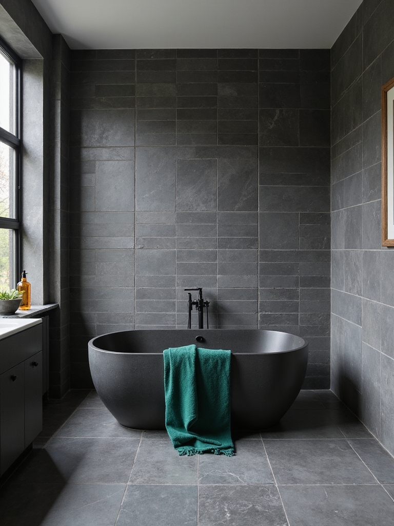
Charcoal reads bold on a tile backdrop, and pairing it with vivid accents turns a bathroom into a confident, gallery-worthy space.
I gravitate toward saturated blues, emeralds, and brass for contrast, keeping lines clean and textures tactile.
Balance is key: let the charcoal ground the room while bold accents spark personality.
Subtle lighting amplifies depth without overpowering the mood.
To enhance this effect, incorporating fresh and earthy green tones can add a natural vibrancy that complements charcoal’s depth.
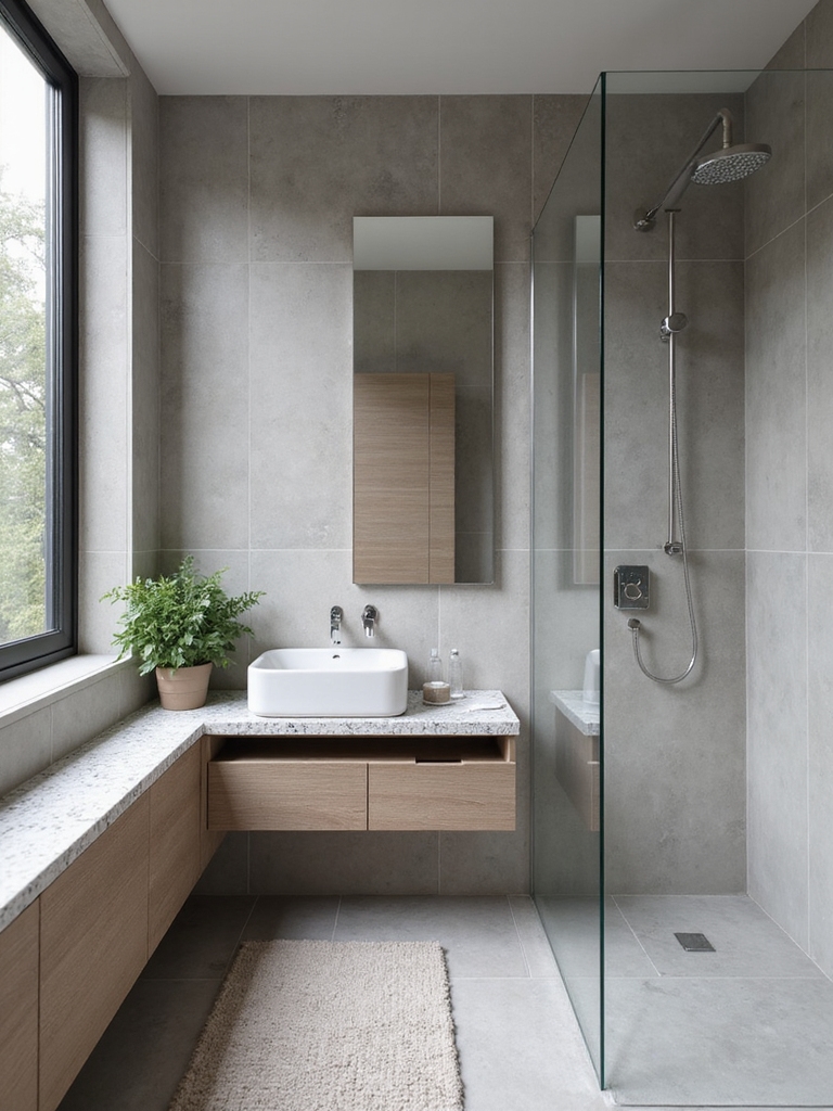
Soft Dusty Silver for Subtle Color Contrast
Soft dusty silver brings a quiet glow to the bath, with Subtle Silver Accents that catch the light without shouting.
I love how Dusty Hue Pairings, like soft blues or warm beiges, create a gentle rhythm across tiles and grout.
If you try Soft Contrast Techniques, you’ll see texture and tone play together for a refined, lasting calm.
Grey tones are a timeless choice in bathroom design, offering lasting elegance that never goes out of style.
Subtle Silver Accents
I love how soft, dusty tones catch light and unify bold patterns with gentle contrast.
Think brushed fixtures, rimmed niches, or glass mosaic borders that feel airy rather than loud. They anchor color pops without competing, keeping the space serene, modern, and irresistibly finished.
Dusty Hue Pairings
Dusty hues in silver offer quiet contrast that keeps bathroom tile feeling modern rather than loud.
I pair soft dusty silver with smoky blues and pale blush accents, balancing cool and warm without shouting.
My goal is subtle depth, not drama, so I choose matte finishes and restrained textures.
The result is cohesive, refined, and easy to live in daily.
Soft Contrast Techniques
Moving from muted dusty hues to softer contrasts, I’ve learned that the right balance keeps a bathroom feeling calm rather than clinical.
Soft contrast, like dusty silver accents, highlights texture without shouting. I pair matte tiles with glossy fixtures, light grays with pale blues, and value shifts that guide the eye.
It’s understated, elegant, and endlessly adaptable. Readers notice harmony, not hype.
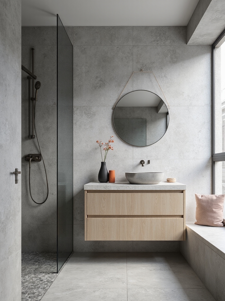
Warm Greige Foundations That Play Well With Color
I love how warm greige foundations set the stage for color to shine, without shouting.
These color-ready bases pair naturally with bold accents and soft hues, giving you endless decorating latitude.
Let’s explore how subtle undertones and cozy depth can elevate your tile choices and overall mood.
Incorporating sleek and timeless modern grey elements can enhance the sophistication and longevity of your bathroom design by creating a balanced and inviting atmosphere with modern grey bathroom inspiration.
Warm Greige Pairings
Warm greige creates a versatile foundation that readies any color you love to pop.
I pair it with crisp whites for contrast, or deepen drama with charcoal accents that still feel soft.
Subtle taupe undertones gracefully balance bolder blues or greens, while warm undertones keep everything cohesive.
The result: eye-catching yet timeless, a bathroom that feels thoughtfully curated and welcoming.
Color-Ready Foundations
I apply this base deliberately, pairing soft tones with vibrant tiles to keep balance.
You’ll notice cohesion, not chaos, as hues mingle gracefully.
This approach grants flexibility, inviting playful palettes while maintaining timeless, refined bathroom elegance.
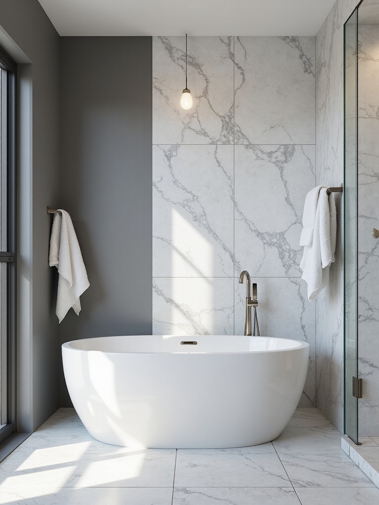
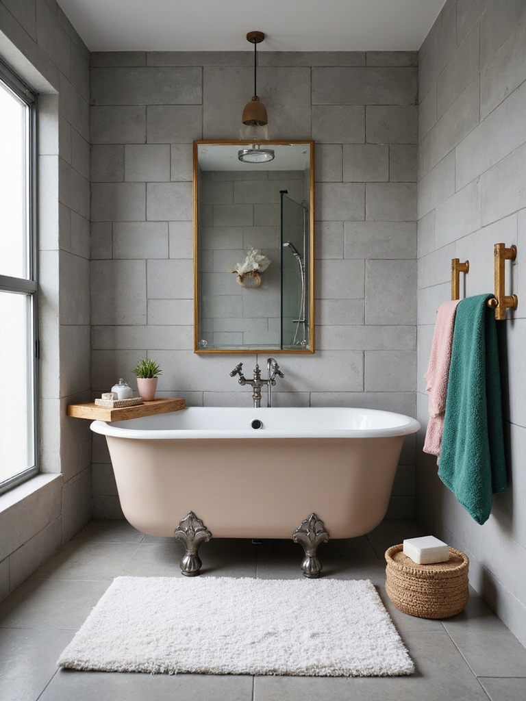
White Accents to Make Color Pop on Grey Tile
White accents are the simplest way to make a grey tile feel fresh and dimensional, and they instantly pull color into focus.
I’m often surprised how tiny white touches—towels, trim, or a floating shelf—lift the room without shouting.
I pair crisp whites with bold accessories, letting saturated hues breathe against clean, bright backdrops for lively, balanced contrasts.
Incorporating white elements is a key technique in creating modern and minimal grey and white bathroom designs.
Navy and Grey: Depth Without Dragging Down the Light
I love how deep navy accents can anchor a soft grey palette, giving the space quiet drama without overpowering light.
I’ll pair those rich tones with light-reflecting surfaces to bounce brightness around the room.
Incorporating elegant grey ensuite bathroom inspirations can transform your space into a tranquil retreat filled with subtle sophistication.
Deep Navy Accents
I weave navy into cabinetry, tiles, or towels for a sophisticated punch, then balance it with warm whites and mellow textures.
The result feels focused, inviting, and undeniably chic—rich without overwhelm, crisp without cold rigidity.
Light-Reflecting Surfaces
Light reflects differently in a navy-and-grey palette, catching the eye without shouting.
I pair glossy navy tiles with soft grey tones to boost brightness while keeping depth. Shiny surfaces bounce light around the room; matte floors ground the scheme.
I emphasize clean lines, simple patterns, and thoughtful grout to maintain clarity and polish without overwhelming the space.
Balanced Tone Strategies
Navy and grey create depth without weighing down the room, especially when you mix glossy tile with softer, matte accents.
I guide you to balance tones so contrast reads as definition, not drama. Here are key moves:
- Pair navy cabinetry with pale grey walls
- Use charcoal grout for subtle line work
- Add a bright accent rug to lift the entire look
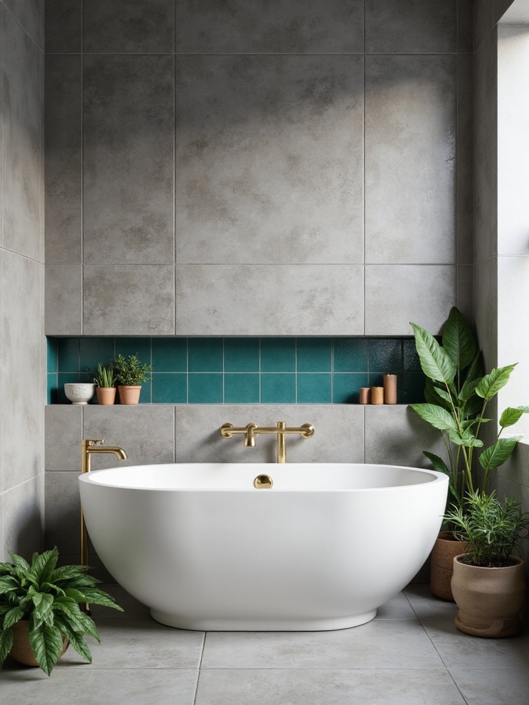
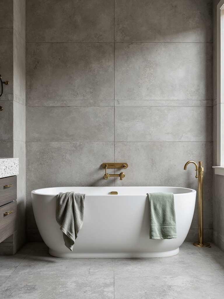
Emerald or Forest Green Combos With Grey Tile
Emerald and forest greens pair beautifully with grey tile when you want a refreshed, yet timeless bathroom.
I suggest pairing deep greens with cool gray tiles for a sophisticated base, then add lighter greens as accents to keep the space airy.
Use matte finishes on larger surfaces and glossy accents in fixtures to create depth, without shouting color.
Designers are especially obsessed with incorporating olive green bathroom ideas to add warmth and subtle earthiness to the space.
Mustard, Coral, and Orange Pops Against Grey
I love how mustard pops against grey, brightening the tile with a sunny lift.
Coral adds warmth, softening the contrast and inviting a cozy, spa-like vibe.
Orange accents create daylighting contrast, keeping the space lively without shouting.
Pairing these vibrant colors with timeless white and grey elements ensures a classic and clean bathroom aesthetic.
Mustard Pops Against Grey
- Use small mustard details for balance.
- Pair with charcoal for depth.
- Add textured textures to keep it lively.
Coral Adds Warmth
Coral brings a warm glow that plays beautifully with mustard and orange against cool grey. I’m sharing how this trio livens a bathroom without shouting.
Coral adds depth, while mustard keeps it grounded and orange pops for energy. I suggest balanced accessories and tiles in matte textures to prevent glare.
Together, they feel lively, inviting, and thoughtfully modern.
Orange Accents Daylighting Contrast
Orange accents can wake a grey bathroom with a daylight-driven contrast that feels both fresh and intimate.
I guide you through how mustard, coral, and orange pops breathe warmth without shouting, using natural light to sharpen texture and mood.
- Highlight a single focal tile
- Pair soft grey with warm neutrals
- Balance saturated accents with cooler whites
Jewel-Toned Accessories to Elevate Grey Tile
When grey tile feels too cool, jewel-toned accessories are the vibrant lift you need, adding warmth and personality without overpowering the space.
I pair emerald, sapphire, and ruby accents with clean chrome and matte black fixtures, letting color pop against neutral walls.
A velvet towel, glass vignette, or ceramic dish anchors the eye, elevating sophistication while staying approachable.
These touches can help you elevate your space with a look that feels instantly expensive.
Texture Mix: Brick, Mosaic, and Patterned Tiles
Texture is where you can play the most, mixing brick with mosaic and patterned tiles to create contrast and rhythm.
I’ll show you how brick’s rugged warmth plays off crisp mosaic and bold patterns, so texture itself becomes the room’s voice.
Let’s explore how this mix guides light, scale, and mood, one careful pairing at a time.
Texture Texture Mix
Texture can take a bathroom from flat to unforgettable, so I like mixing bricks, mosaics, and patterned tiles to build visual interest without overwhelming the space.
- Focus contrasts: brick warmth against cool mosaic details
- Rhythm: repeat a tile motif across walls and bench
- Balance: pair bold patterns with solid, airy tones
This texture mix feels curated yet playful.
Tile Type Contrast
I mix textures intentionally, pairing matte bricks with glossy mosaics and bold patterned tiles to create focal points. You’ll notice depth, contrast, and personality without shouting.
I keep lines clean, colors coordinated, and balance tactile interest with practical maintenance.
Lighting to Elevate Color in a Grey Tile Bath
If you want a grey tile bath to feel warmer or more dynamic, start with lighting that accentuates color shifts rather than washing them out.
I’ll guide you with purposeful illumination that highlights the hues you love.
- Use adjustable warm-to-cool LEDs
- Pair indirect, diffuse sources with spot accents
- Test color temps on tiles before committing
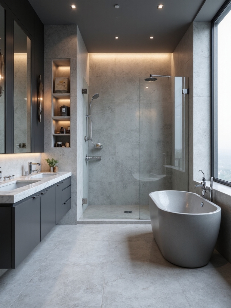
Metal Finishes That Boost Color Impact
Metal finishes can make color pop by reflecting and refracting light differently across tile surfaces.
I love how brushed brass or cool chrome highlights transform matte grey tiles, adding warmth or punch without overpowering the palette.
Pair metals with subdued grays for contrast, or mirror-like accents for drama.
Keep scale in mind, and let a single metallic feature spark visual conversation.
Wall Paint and Vanity Colors That Harmonize With Grey
Grey walls and a clean vanity set the stage for a calm, cohesive bathroom.
I’ll walk you through color pairings that harmonize with grey, keeping balance front and center.
- Soft neutrals (taupe, warm whites) keep the mood serene and timeless.
- Cool blues/greens add revitalizing contrast without shouting.
- Warm accents (mellow wood, creamy brass) create inviting depth.
Patterned Shower Curtains and Rugs for Boldness
Patterned shower curtains and rugs are the quickest way to inject bold personality into a grey bathroom, and they don’t have to shout to make a statement.
I choose patterns with clean lines or playful motifs, balancing them against neutral tiles. The right contrast elevates space, while repeating accents tie the room together, creating cohesion without overwhelming the senses.
Minimalist White-On-Grey With Thoughtful Color Touches
White-on-grey bathrooms feel calm and modern, a clean canvas that makes thoughtful color pops feel intentional rather than chaotic.
I keep accents subtle yet strategic, letting textures and light do the speaking, while I guide you to color with care.
- Choose a single bright hue for small accents
- Tie towels, mats, and hardware to that hue
- Use matte finishes for polish, not clutter
Budget-Smart Color Moments Without Overdoing It
Budget-smart color moments can punch up a bathroom without blowing the budget or cluttering the feel.
I mix small accents—a towel, bath mat, or vases—in bold hues or soft pastels to lift the tile without shouting.
I keep patterns minimal, repeat a color across elements, and let natural light carry the mood.
Subtle, intentional pops, realized simply.
Common Small-Bathroom Color Pitfalls to Avoid
Color choices in a small bathroom can make or break the feel, so it’s easy to stumble if you chase trends or pile on too many hues at once.
I’ve seen bright clashes kill space, so stay selective. Keep contrast gentle and scale mindful.
- Overloading with bold colors
- Ignoring lighting balance
- Skipping reflective surfaces
Your 5-Point Plan to Build a Cohesive Grey Tile Color Scene
After avoiding the common pitfall of clashing hues in tight spaces, let’s smooth the path to a cohesive grey tile scene with a practical plan.
I’ll outline five clear steps: define a restrained base palette, pick a unifying accent, balance warm and cool notes, test light reflections, and maintain intentional repetition.
With these moves, your bathroom reads polished, inviting, and colorfully cohesive.
Conclusion
Grey tiles are my blank canvas for color, and you’re the artist who brings it to life. Fun stat: homes with cohesive color schemes feel 40% more harmonious in photos than those that don’t. So start with a mood, pick two or three accents, and breathe life into the space. Moody charcoal, dusty silvers, or warm greiges—each choice colors your daily routine. Trust the plan, add touches you love, and watch your bathroom glow with personality.